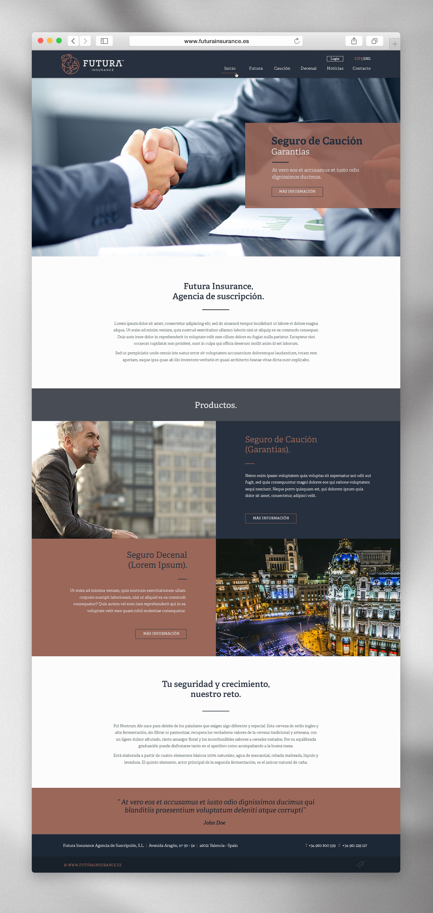
Futura Insurance. Corporate identity design for an insurance company
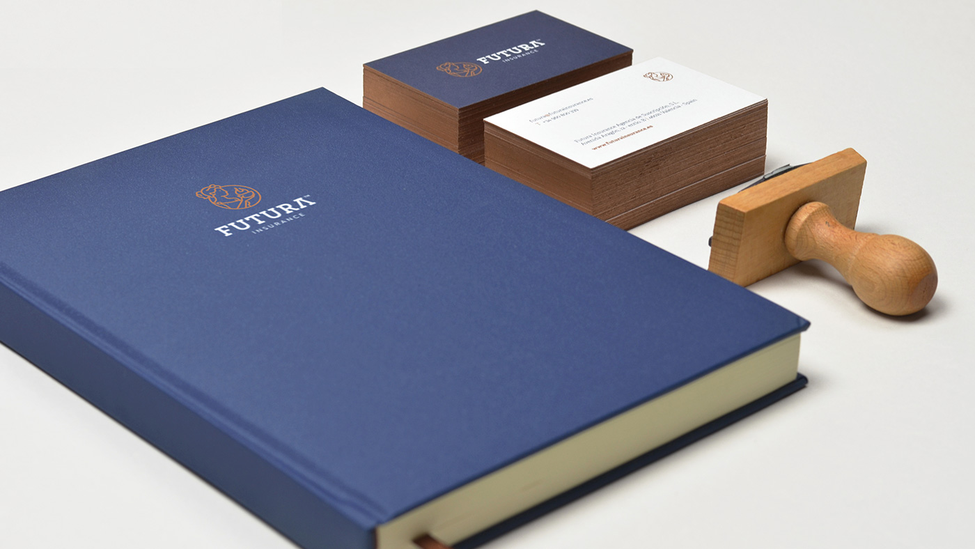
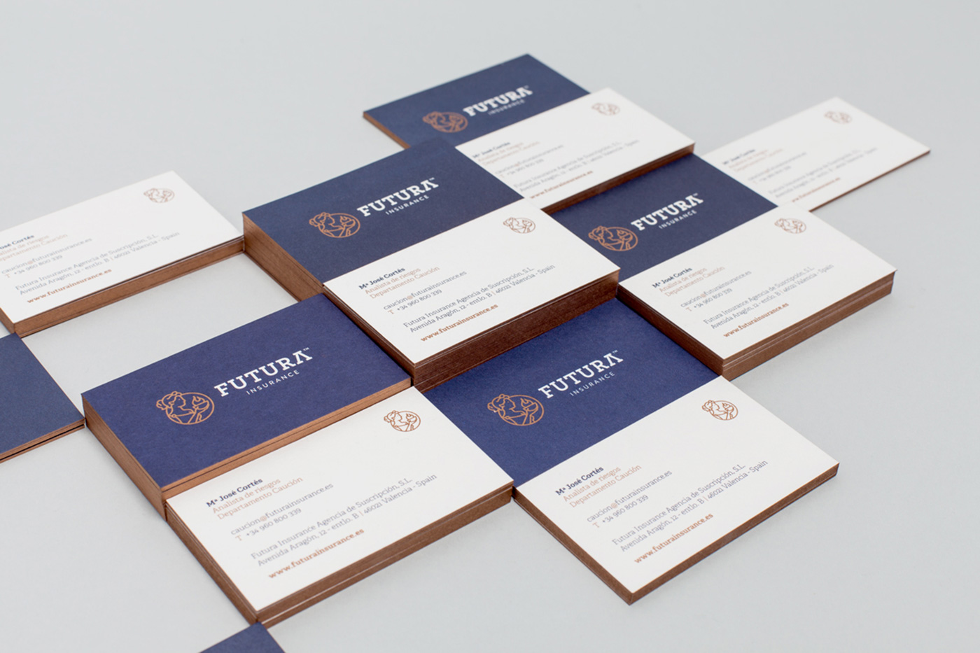
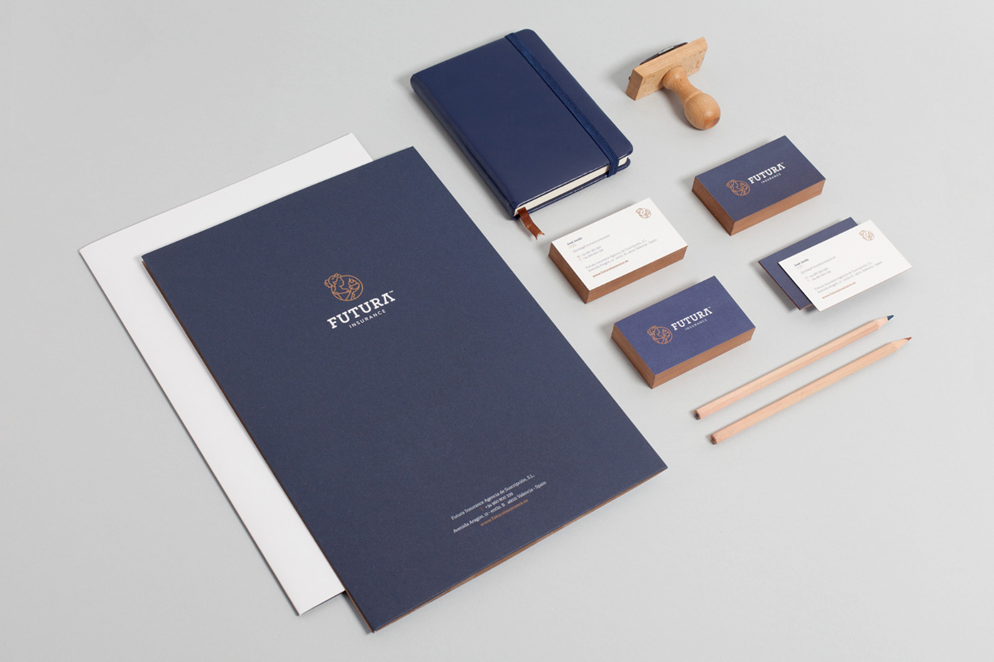
Creation of a logo and isotype, corporate stationary and graphic applications
Futura Insurance is a new risk underwriting agency that works with insurance companies registered in the European Union, whose main characteristic is simple, fast and efficient management, which allows its clients to save a lot of time.
Its business model requires a brand that conveys values such as security, reliability, accuracy, strength and efficiency, but that at the same time preserves a close and approachable nature, that inspires commitment, empathy and loyalty. In order to better define this starting point, we put into practice something that we always do, which is to send our client an extensive questionnaire, this allows us to learn about issues that are fundamental in the construction of the identity, such as the needs of the company, its current situation, or the reality of the industry.
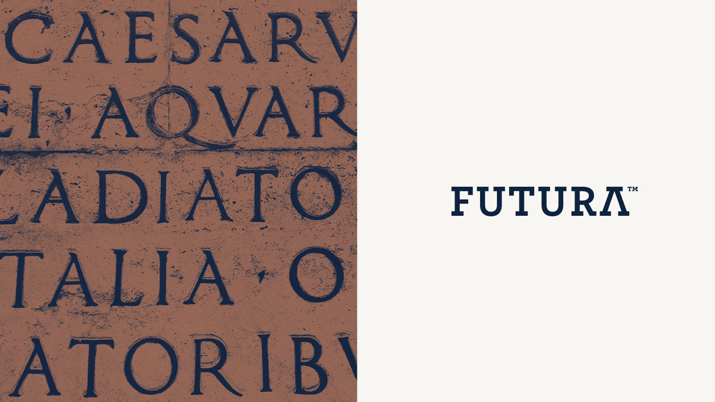
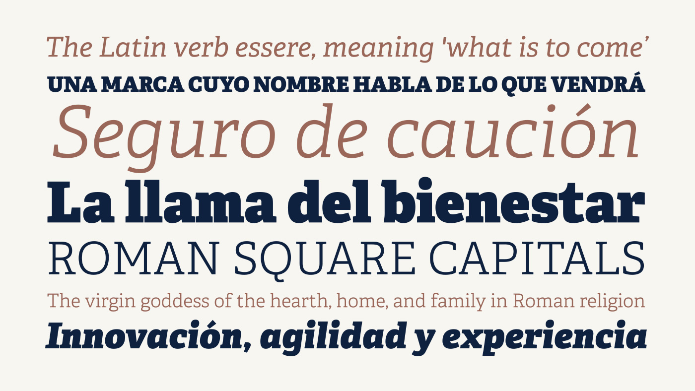
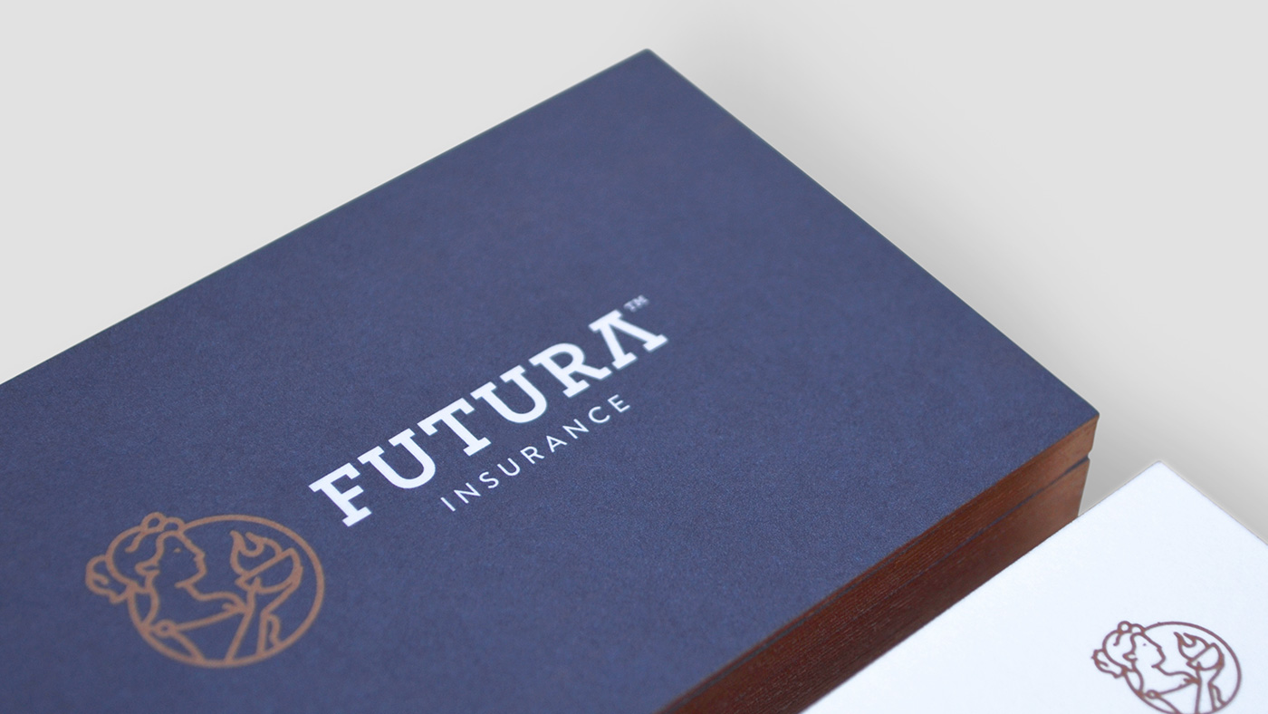
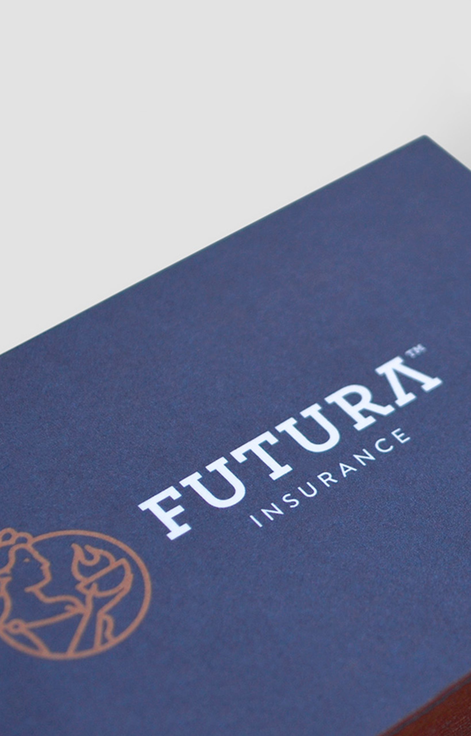
Futura is a participle of the Latin verb essere, meaning ‘what is to come,’ so we started working on the corporate identity, having the Latin aspect of its name in mind as a concept. We developed the typography based on the robust Roman capital letters that provide the values of strength and dependability that we were looking for, but we updated its forms by employing a slab font that we have slightly modified to make it suggestive of distinguished Roman traits.
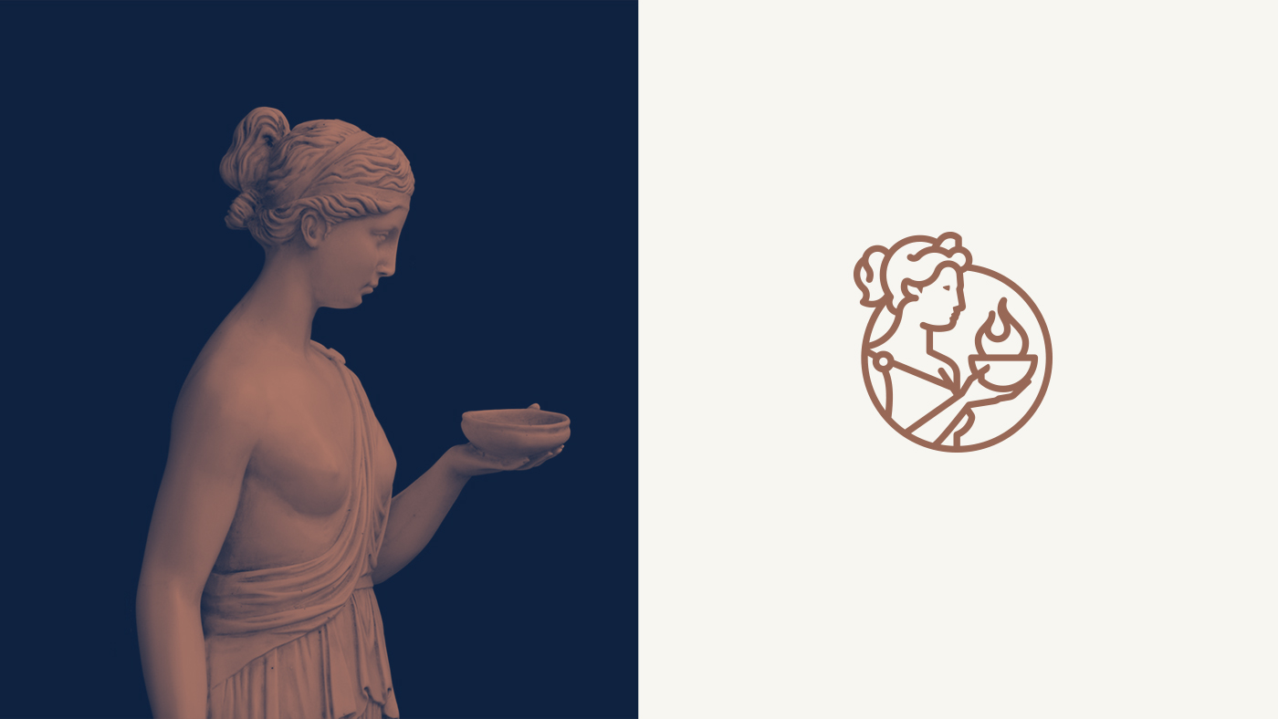
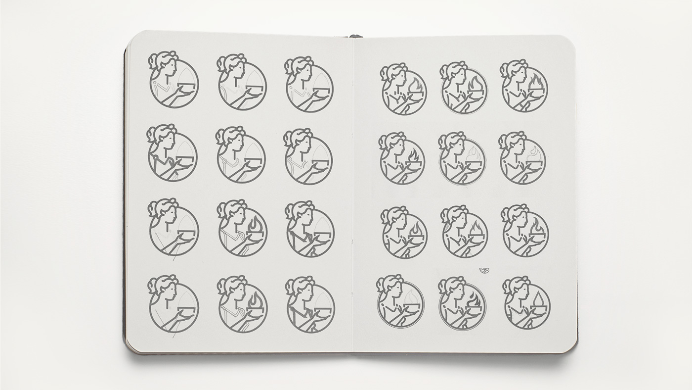
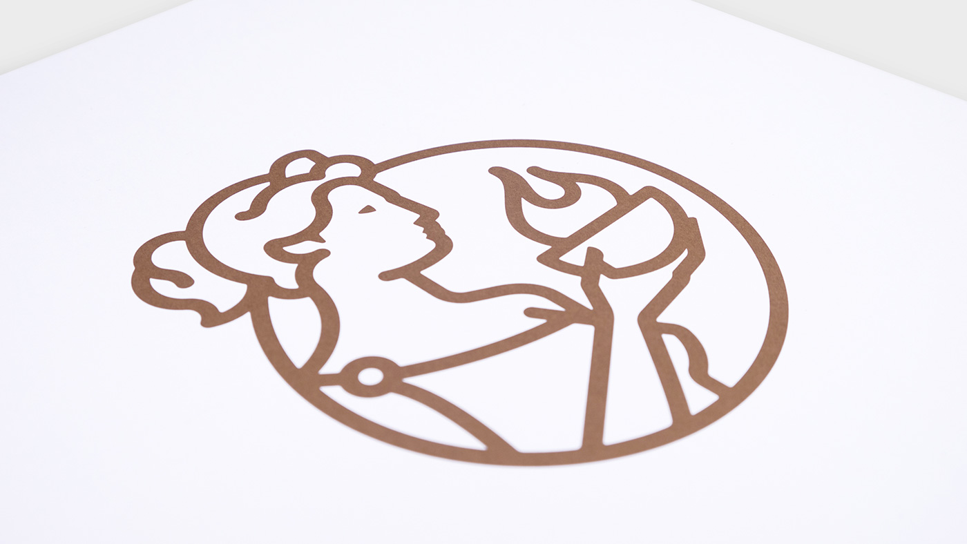
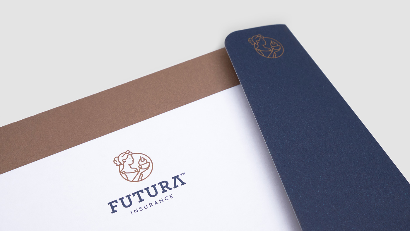
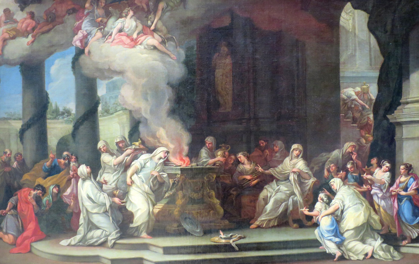
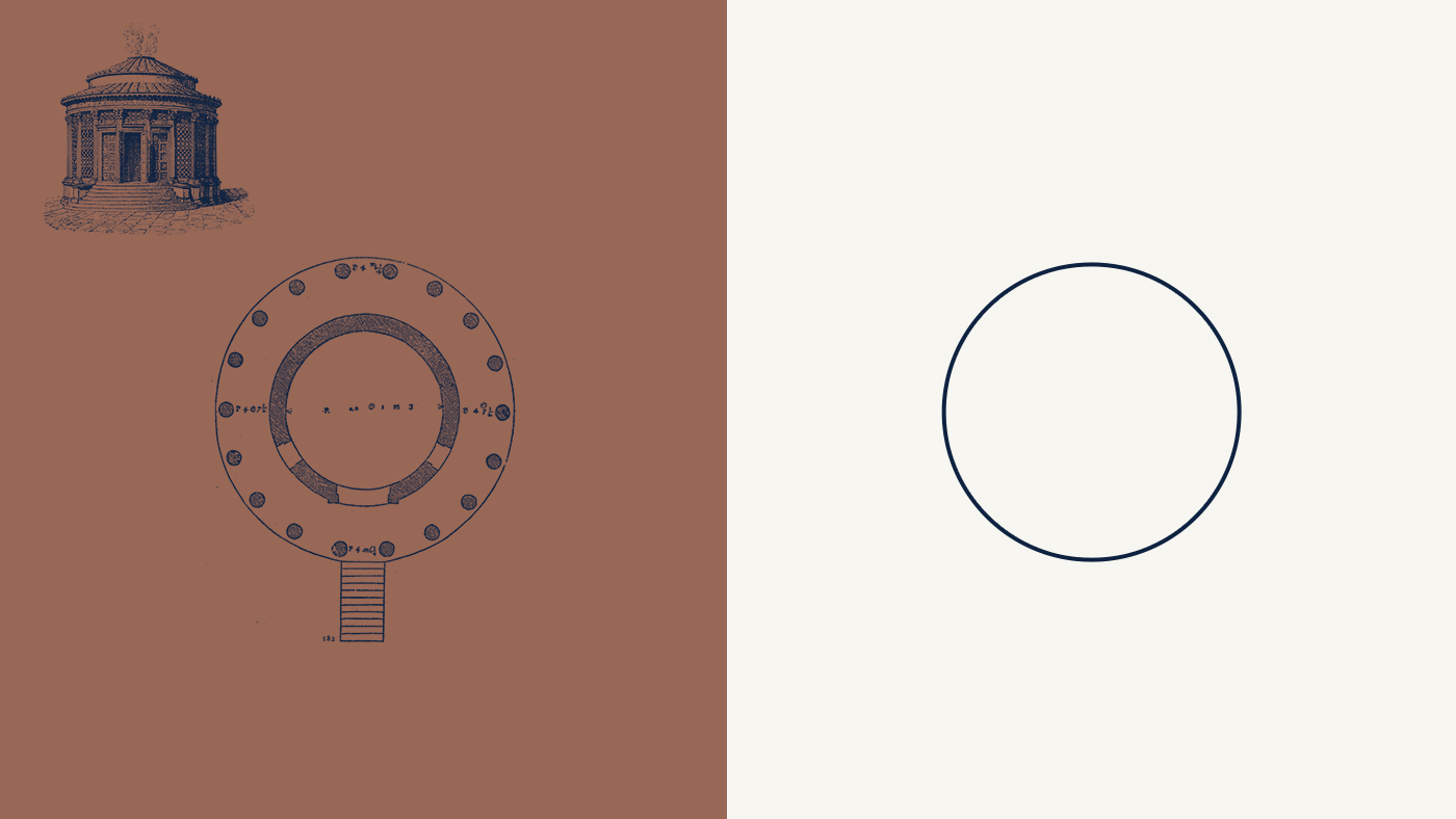
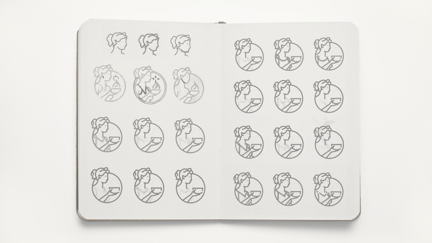
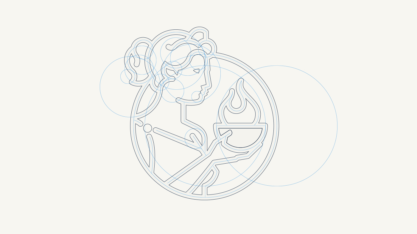
For the icon that would represent the brand, we decided that mythology might be an appropriate environment for finding a reference. After extensively studying – and when we say extensively we really mean extensively – the vast Greek and Roman mythological Pantheon, we found Vesta – Roman deity equivalent to the Greek Hestia – protector of Rome, in addition to being goddess of fire and home. Vesta was depicted carrying a bowl of fire, a flame symbolizing the well-being of the republic.
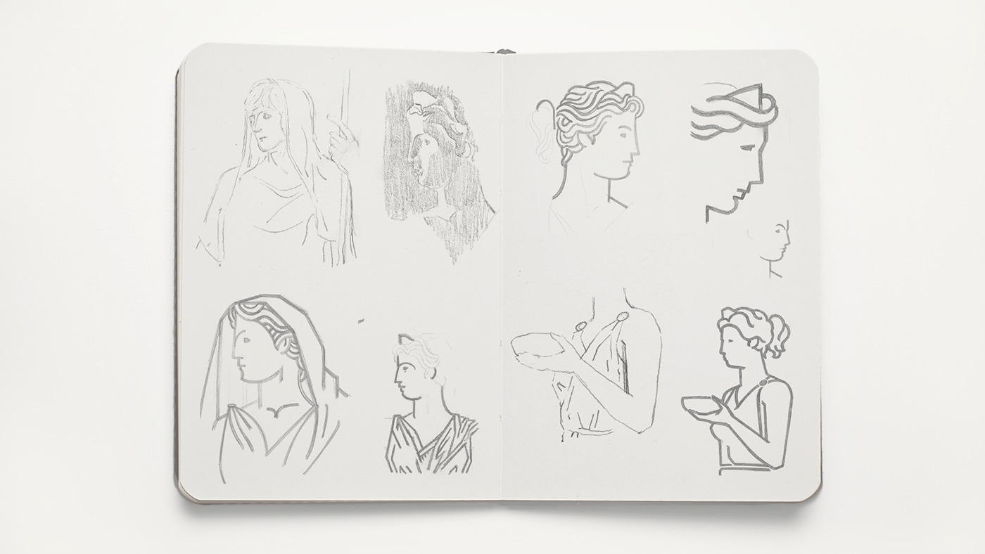
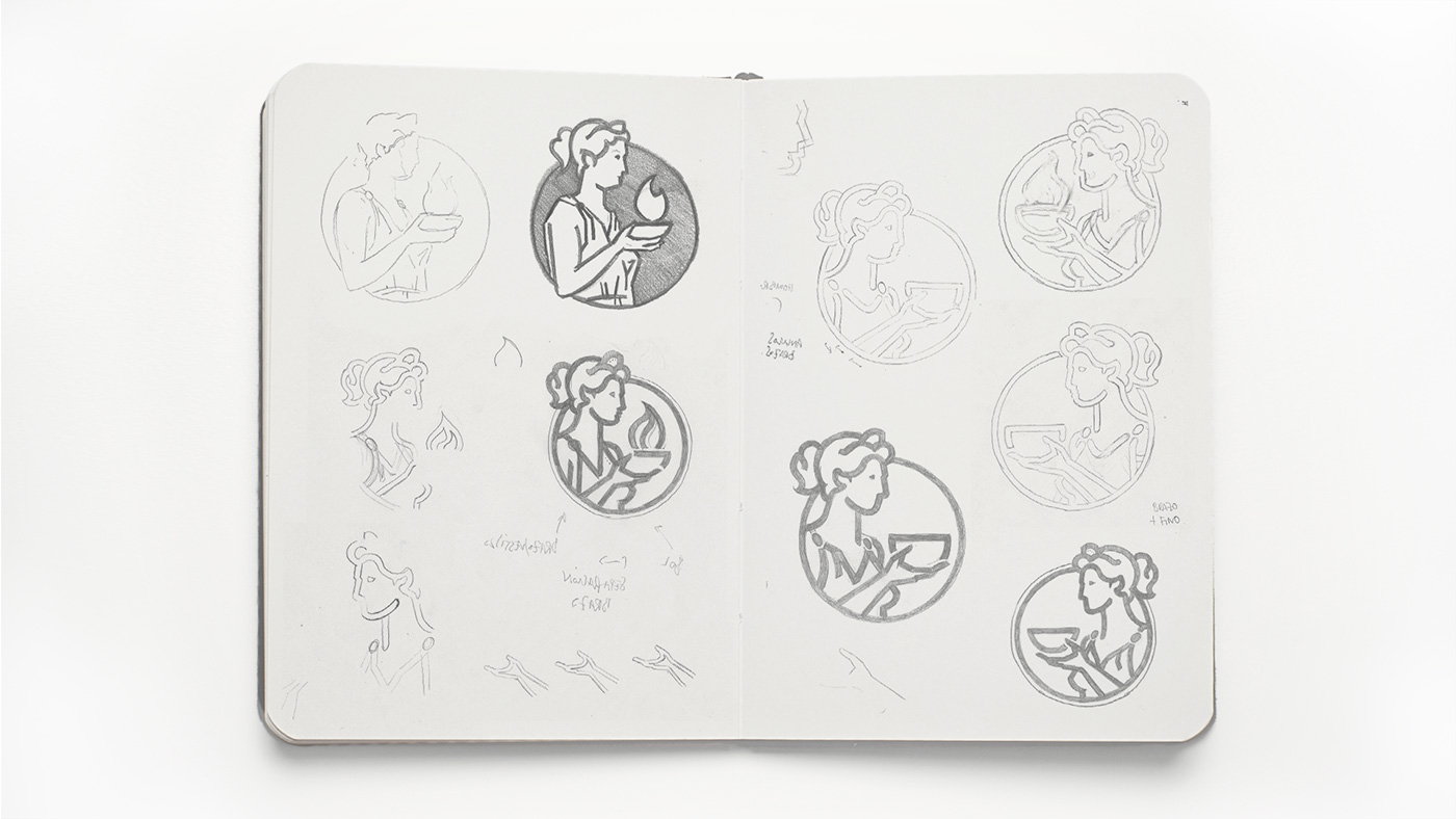
The female form and the keeping of the flame provide us with the traits of closeness that we needed to complement the strength of the Roman typography. Following an arduous process of analysis and summation, we managed to represent the figure of Vesta in a simple and completely recognisable manner.
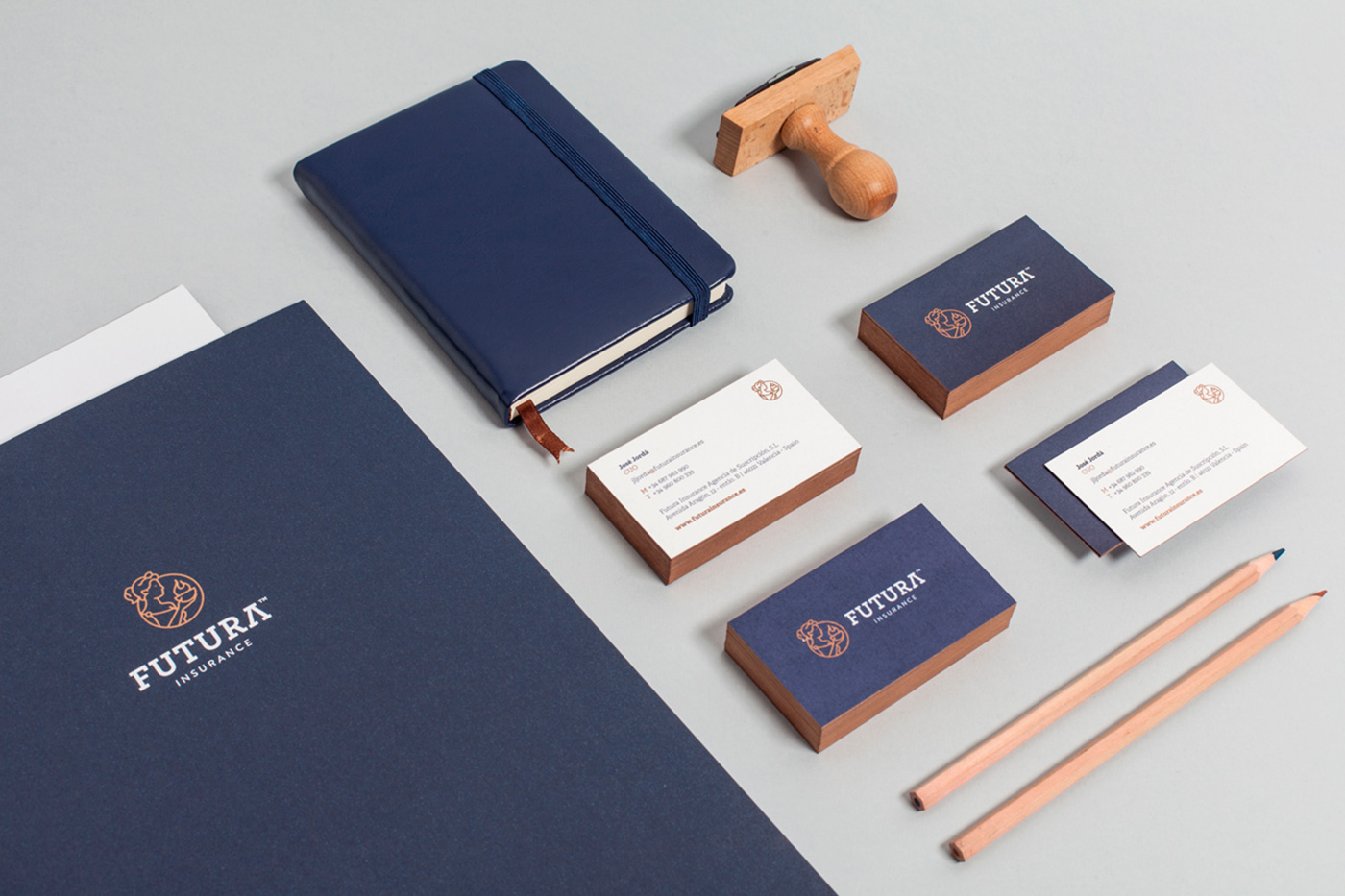
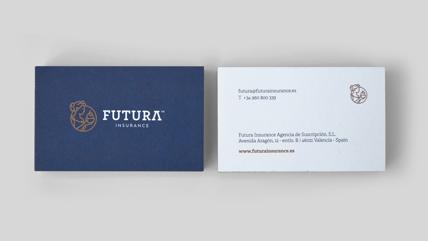
Given that our task is not limited to the design, as we also choose materials, qualities and organise the printing if the client requires us to, in the case of Futura we opted to use premium papers and inks, with a metallic copper color, to close the project with one last nuance that evoked an imposing tradition, solid and known to all, in a brand whose name nevertheless speaks of things that are yet to come.
What did we do?
· Creative direction
· Corporate Identity
“Futura” is a participle of the Latin verb “essere”, which means “what is to come”, so we began working on the corporate identity with the Latin of its naming as a concept.
“The feminine shapes and the care of the fire provided us with the traits of closeness that we needed to complement the Roman typographic strength.”
“For the representation of the brand icon, we decided that mythology could be a coherent environment to find a reference. We found Vesta, the Roman deity equivalent to the Greek Hestia, protector of Rome, as well as the goddess of fire and home.”
“We developed the typography based on the robust Roman capital letters, which bring the values of strength and seriousness that we were looking for, but updating their forms using a slab font that we modified slightly to suggest illustrious Roman traits.”