Design of Esmovia company offices - Training and Mobility
Design of Esmovia's company space, vinyls, signage, lighting, decoration.
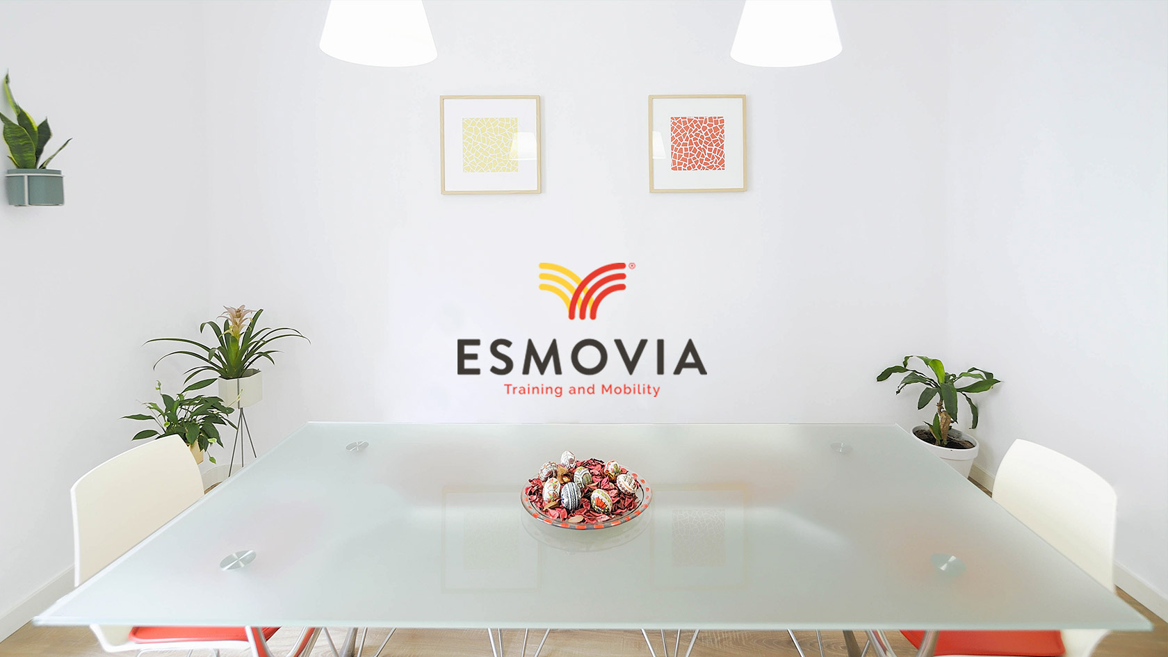
Esmovia is a service company that is responsible for welcoming foreign students and professors and attending to their needs in terms of education, accommodation, and adaptation to the city of Valencia. The quality of the space offered by a company of this nature, through which dozens of people pass every day, is a good indicator of its health as a business: a well-maintained, welcoming, bright space with all its elements in harmony usually goes hand in hand with a prosperous project, while the opposite – a neglected, uncomfortable, and dark space, for example – does not speak very well of the company that operates in it.
While the space where Esmovia worked before contacting us – for an initially corporate image project that you can see here – was not neglected, it is true that it was far from its possibilities. The space presented an evident aesthetic and functional imbalance, due to the fact that it had been constituted by three independent floors joined together. Neither the colors, nor the shapes, nor the textures present in them kept a coherent relationship. The challenge was considerable; fortunately, Angelo, the person in charge of the company, decided to fully trust us to lead the complete renovation of the space: from wiring to lighting, through furniture and decoration. Everything was going to be our responsibility.
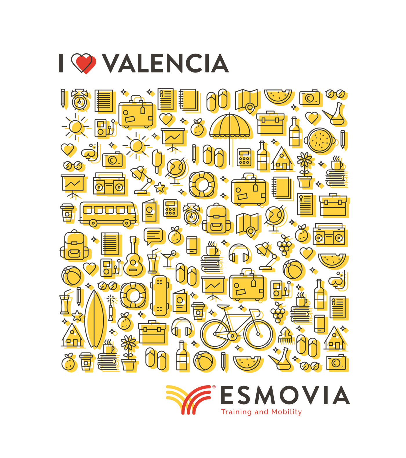
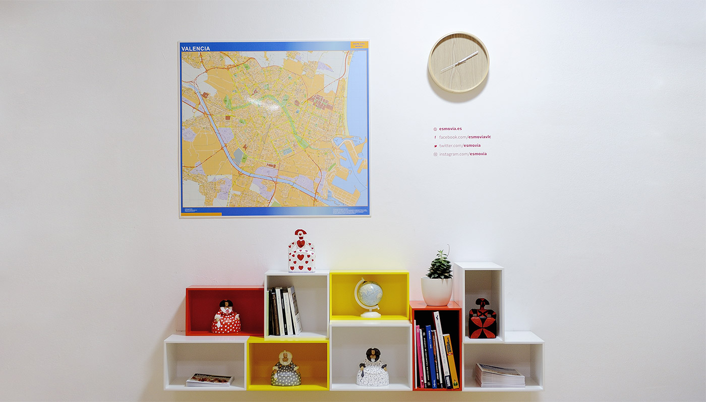
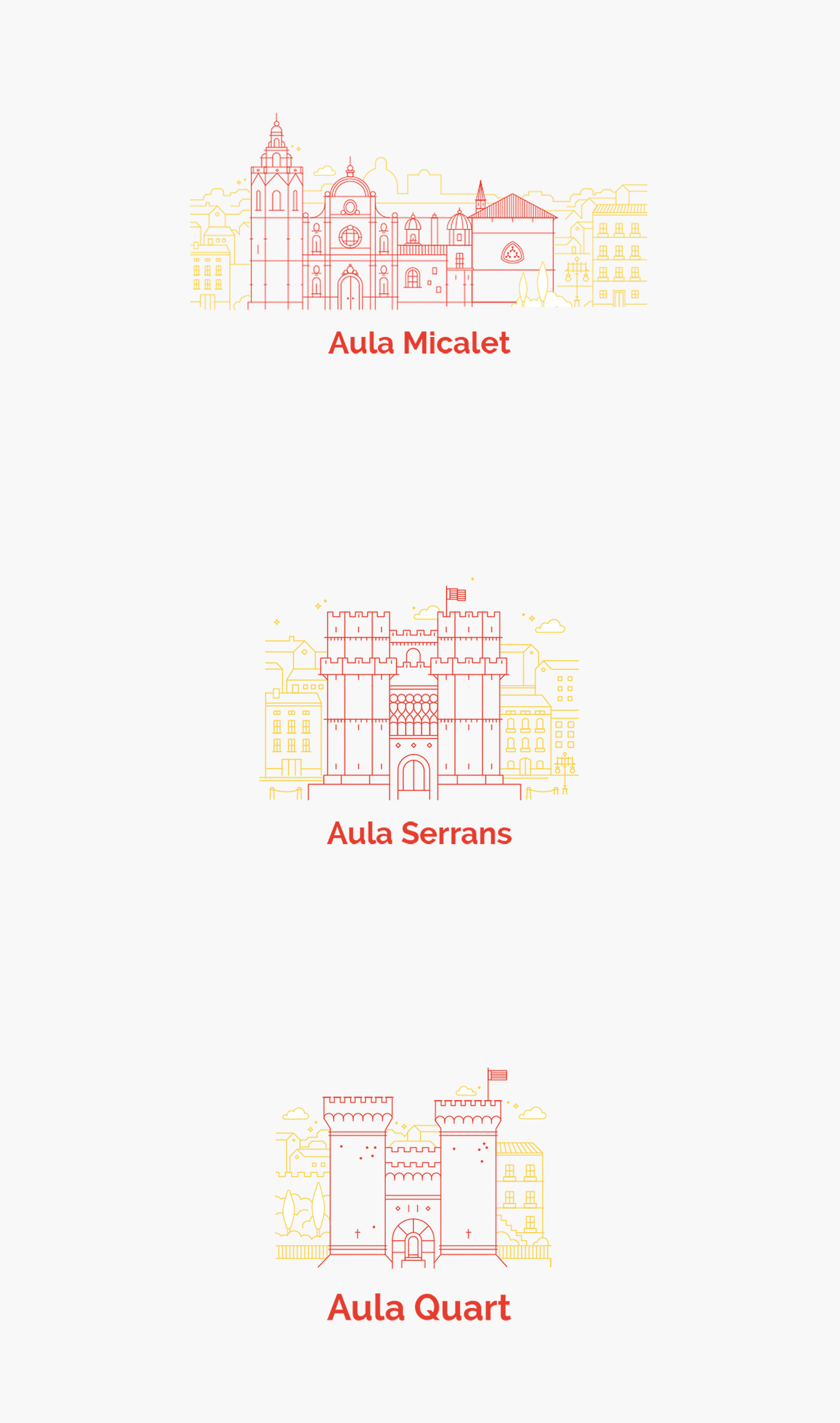
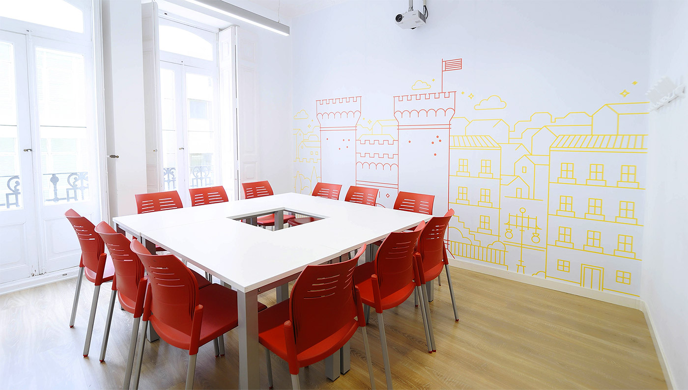
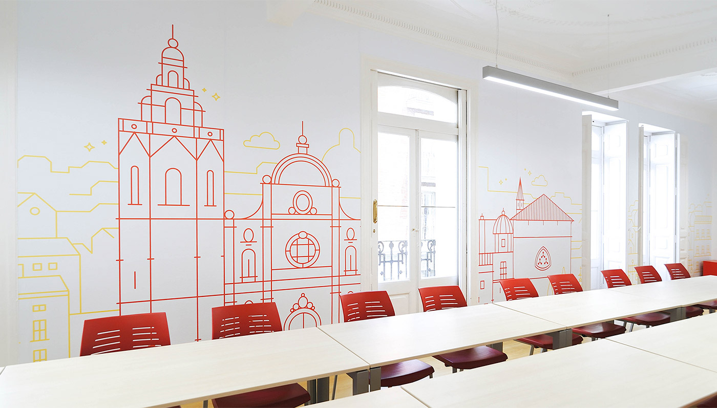
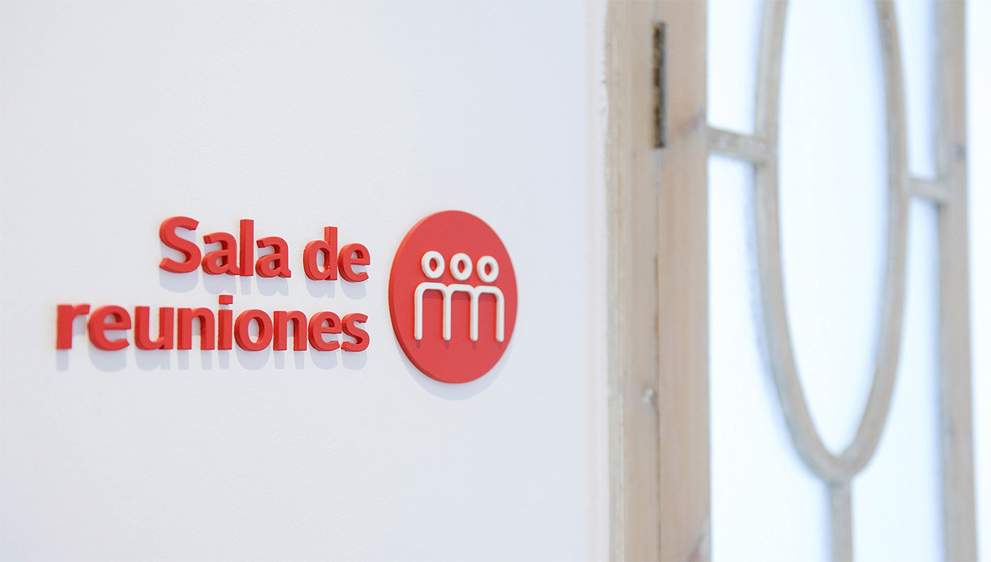
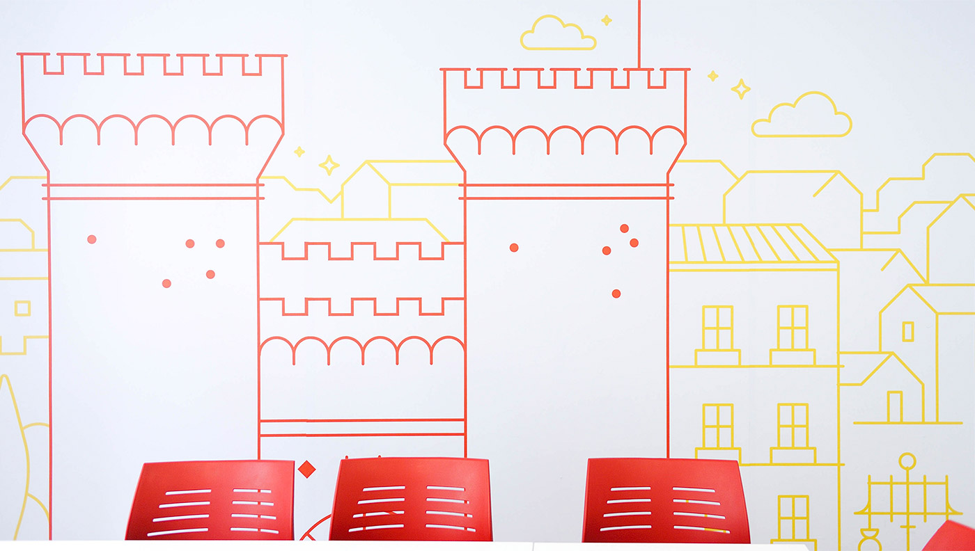
One of the first steps was to unify the style of the walls: for this, we applied the graphics previously developed through paint and vinyl. We also stripped columns to expose the brick, removed obstacles that reduced the available space, and dismantled doors to be treated separately before being repositioned. The wiring of the electrical installation was rearranged in a more discreet way, making it less visible and thus avoiding it being annoying. Similarly, the thematic classrooms, baptized with the name of iconic monuments of the city – the Micalet, the Serranos Towers, and the Quart Towers – were identified with their corresponding image, and we placed a series of illustrations developed for the occasion. The signage, another element that we introduced in the renovation, would provide order to the space, facilitating orientation within it.
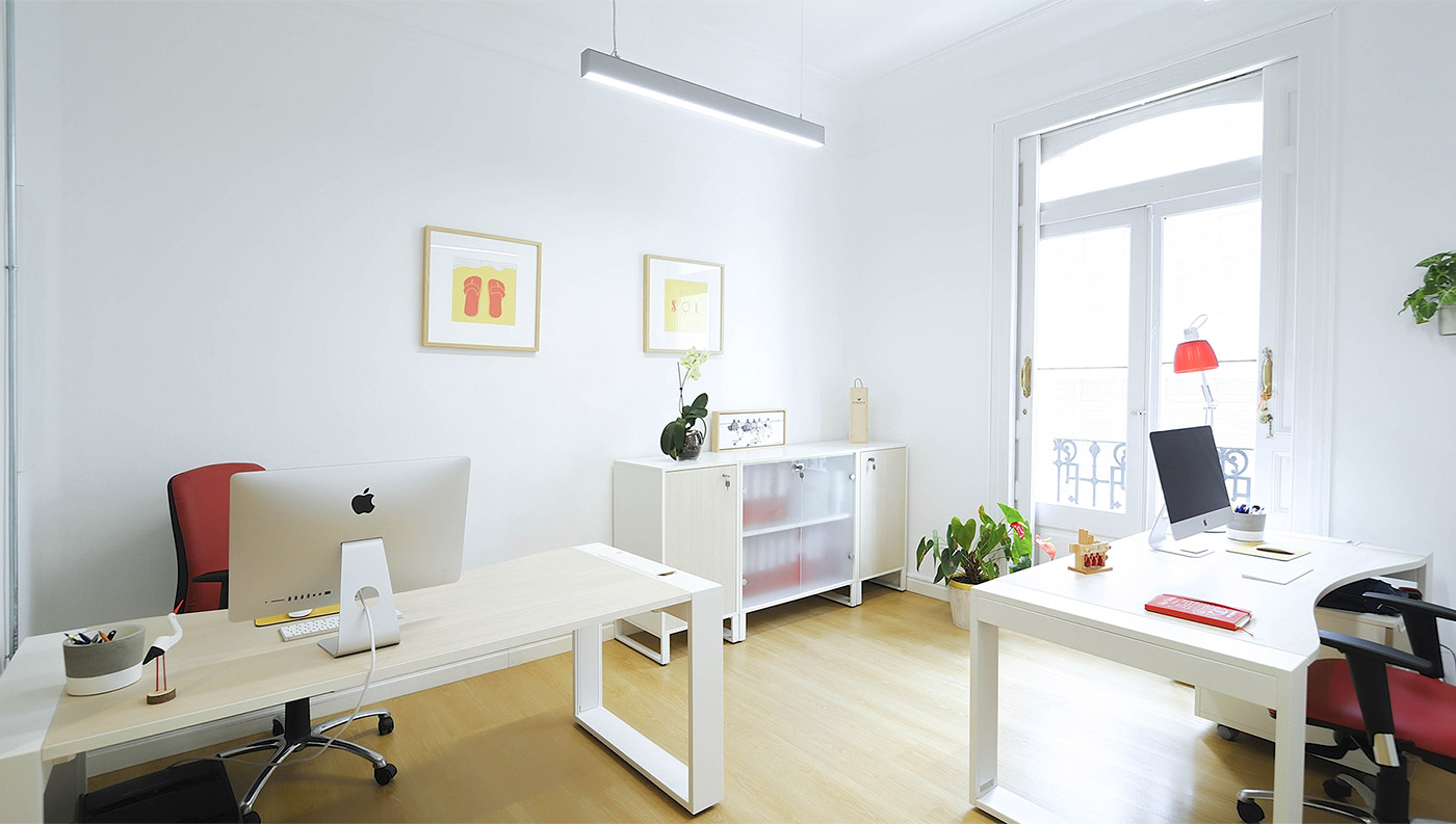
Undoubtedly, one of the most important factors and the one to which we dedicated the most time was lighting. To achieve the result we were looking for, we carried out several studies until we found the desired balance between artificial and natural light. It was not until then that we installed the lamps we had chosen. The change between the previous and the final lighting can be easily appreciated in the photos. With the new lighting, the space became much more pleasant and functional.
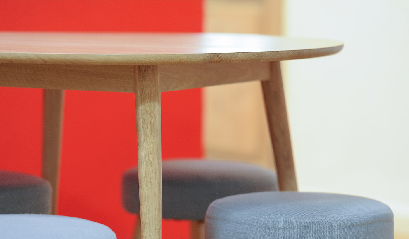
Regarding the furniture that would dress the Esmovia office, we considered that the best option was to take advantage of part of what we already had and invest only in some furniture that we were missing. The change was such that even the furniture that was reused looked like new. Truth be told, the entire office seemed to have opened its doors in another place.
We are very proud of this comprehensive project and would like to express our gratitude to Esmovia again for allowing us to work so smoothly. It was a pleasure.
What did we do?
· Creative direction
· Illustration
· Signage and intervention in spaces
· Production and printing
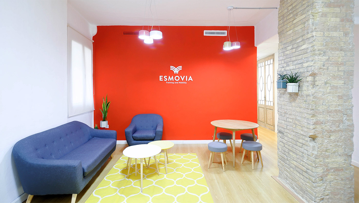
The challenge was considerable; fortunately, Angelo, the head of the company, decided to fully trust us to lead the complete renovation of the space: from wiring to lighting, including furniture and decoration.
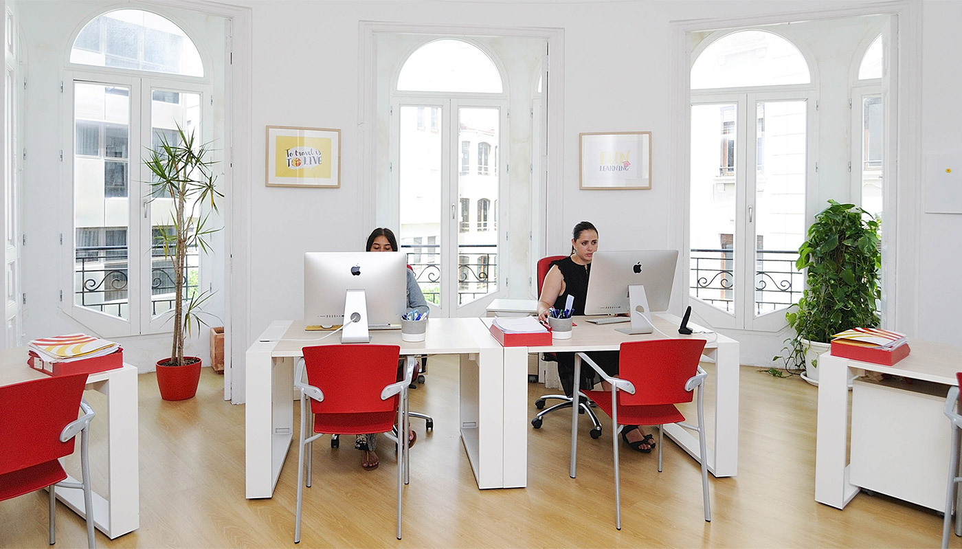
One of the most important factors, and the one that took up the most time, was lighting. In order to achieve the desired result, we conducted several studies to find the right balance between artificial and natural light.
Regarding the furniture that would adorn the office, we believed that the best approach was to reuse some of the existing pieces and only invest in a few pieces that were missing. The transformation was so significant that even the reused furniture looked like new.