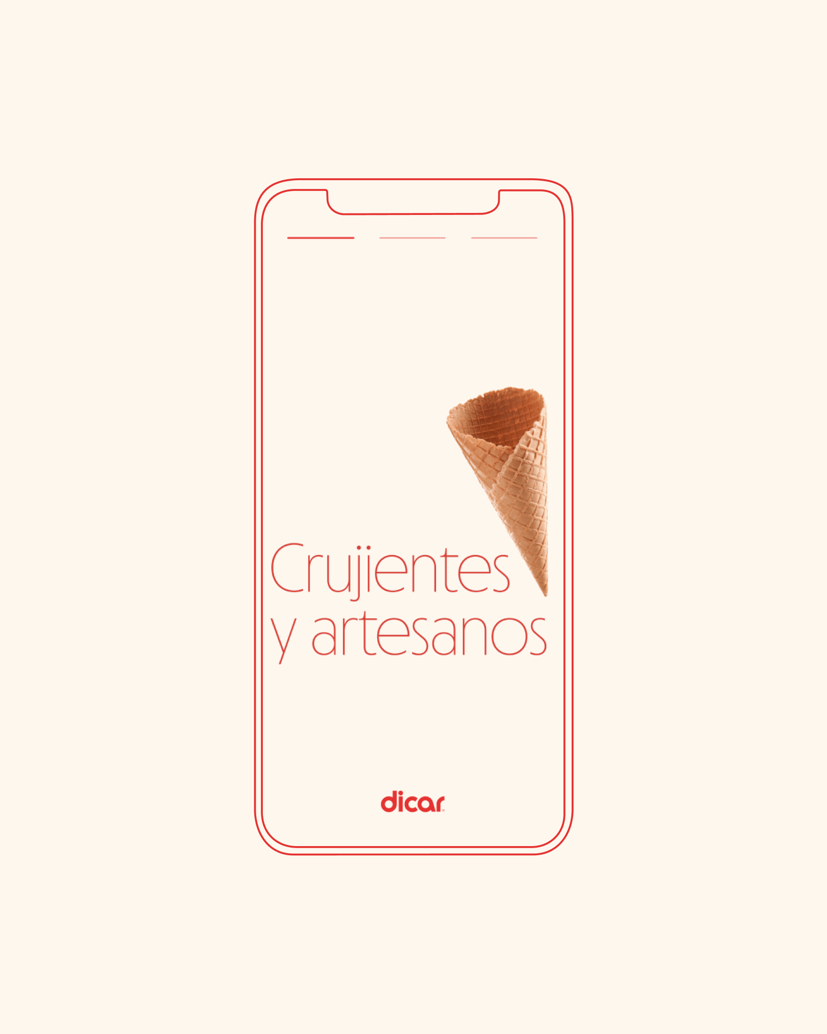
Dicar, a new visual identity and packaging line for the mass market
Brand redesign and creation of a visual system for an icon in the production of ice cream wafers and cones.

What did we do?
· Creative direction
· Brand redesign
· Corporate identity
· Coordinated graphics
· Illustration
· Packaging
· Claims y copy
· Social media graphics
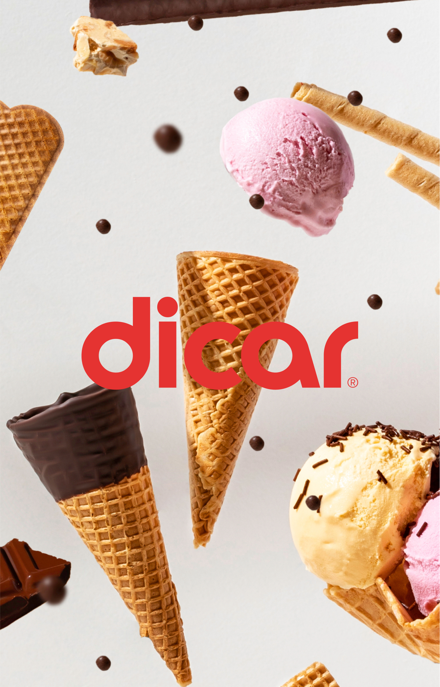
· Photography art direction
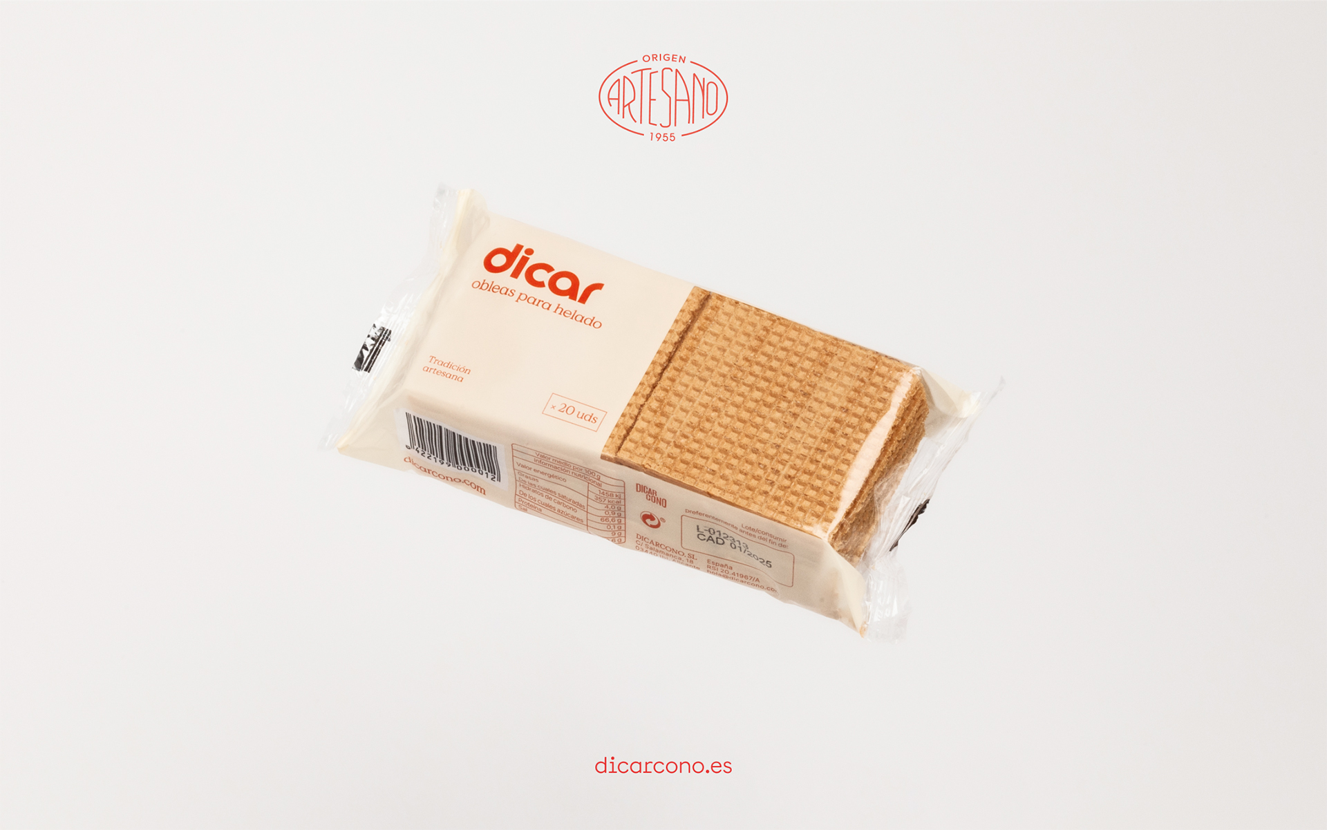
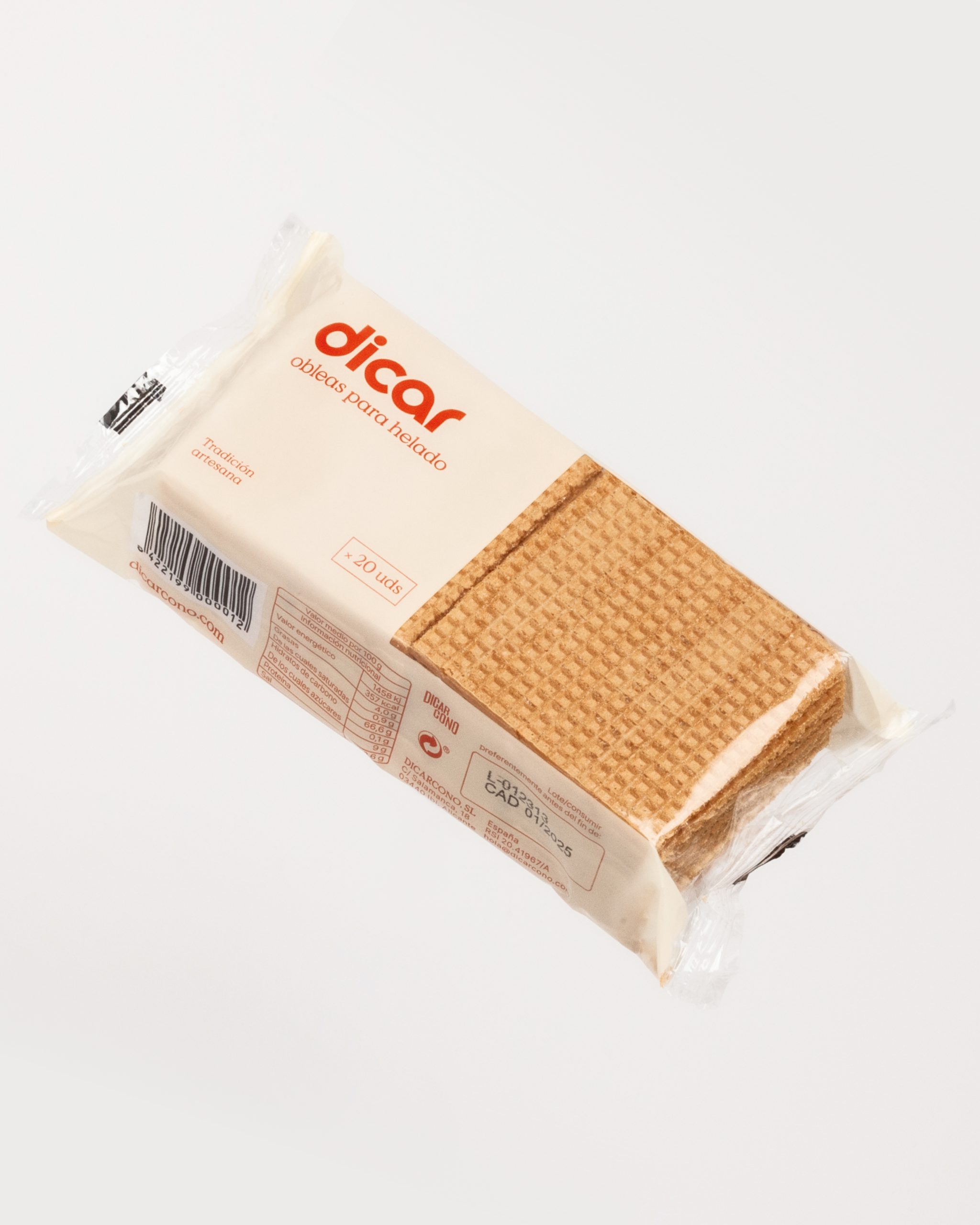
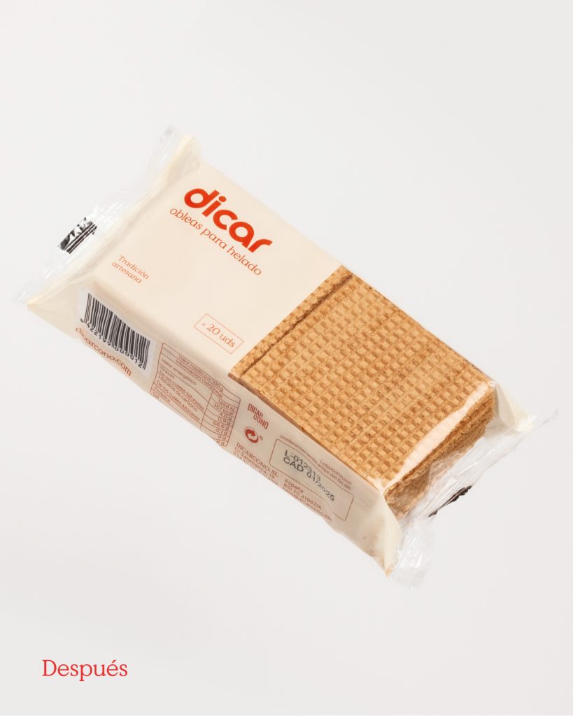
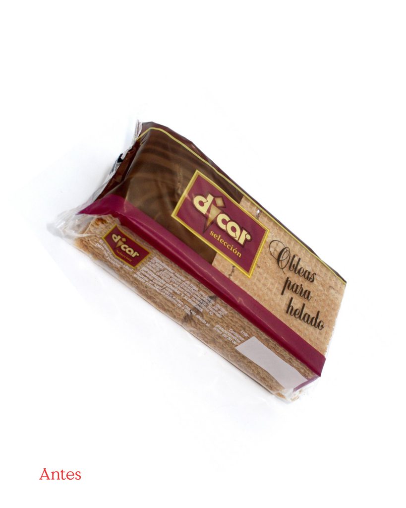
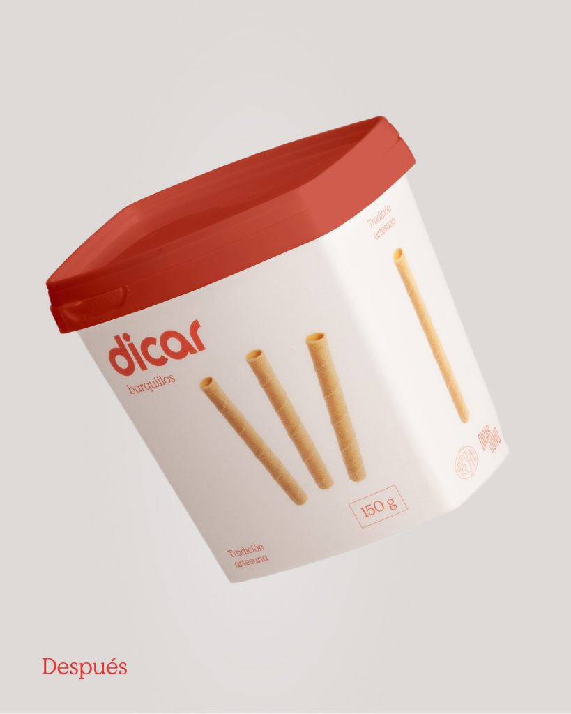
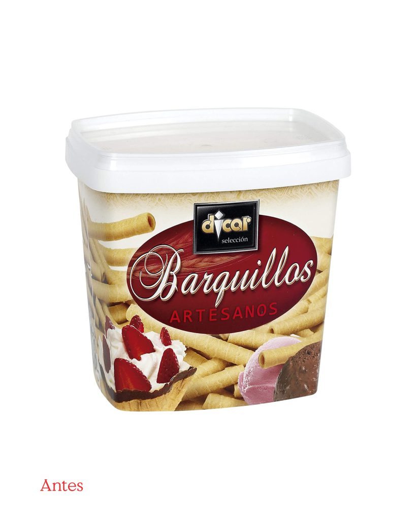
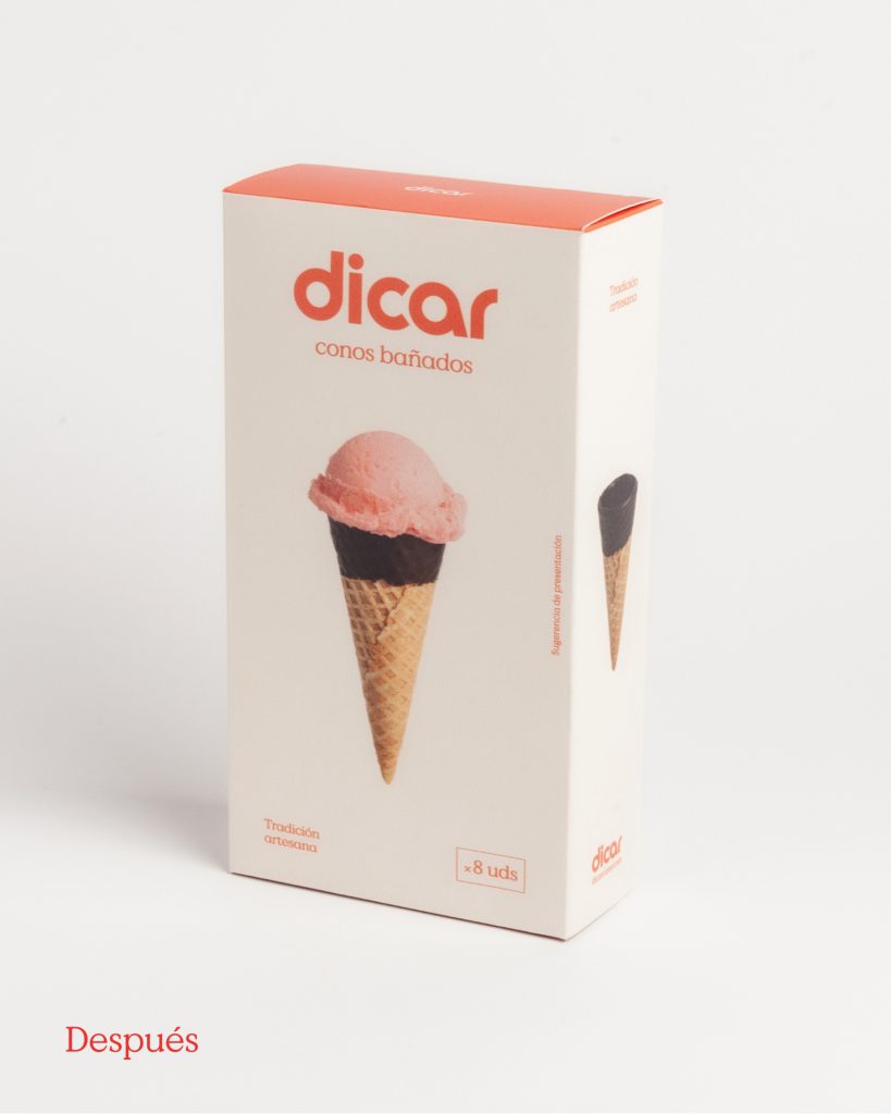
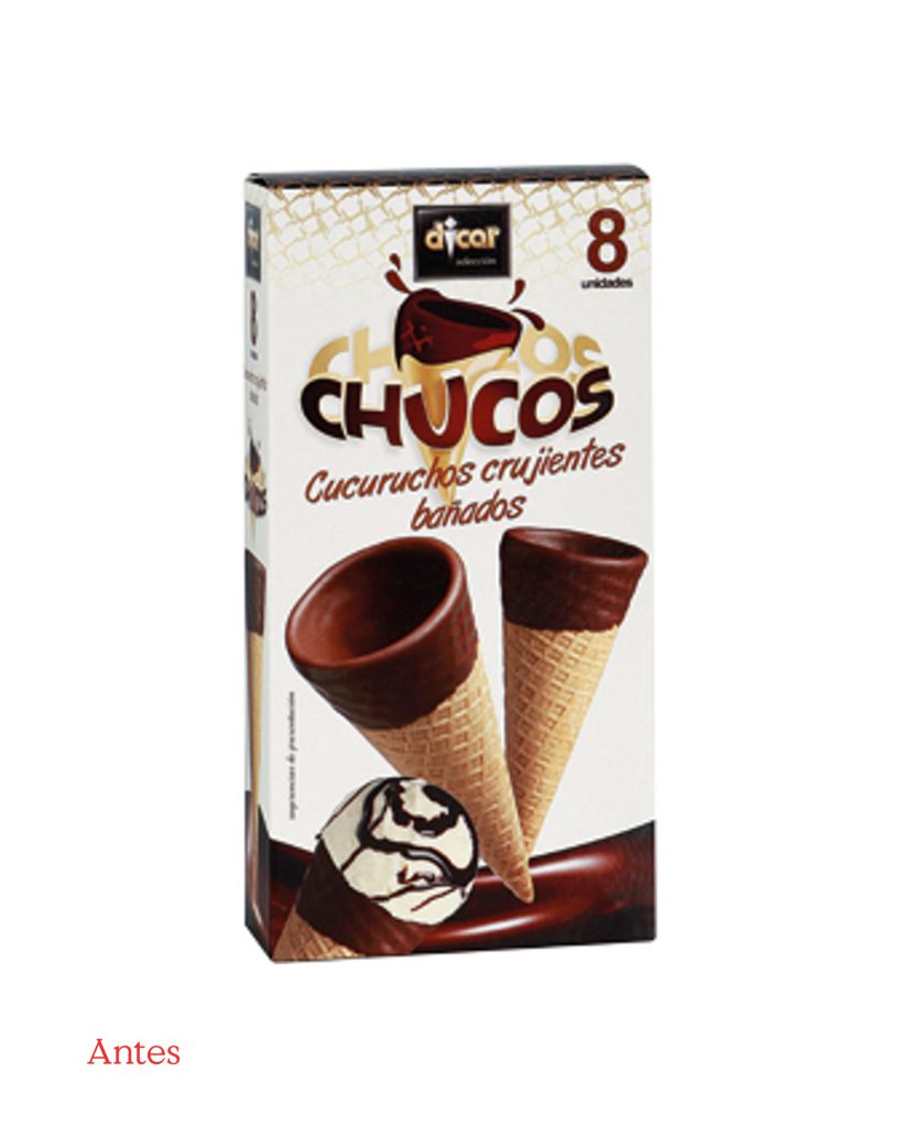
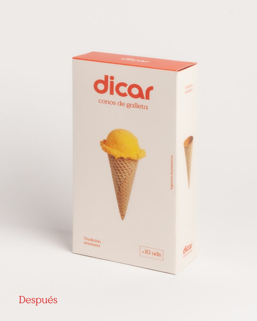
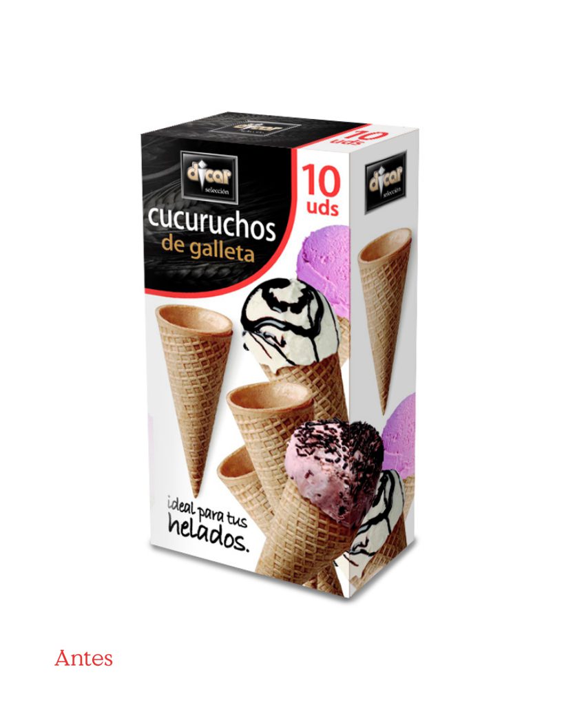
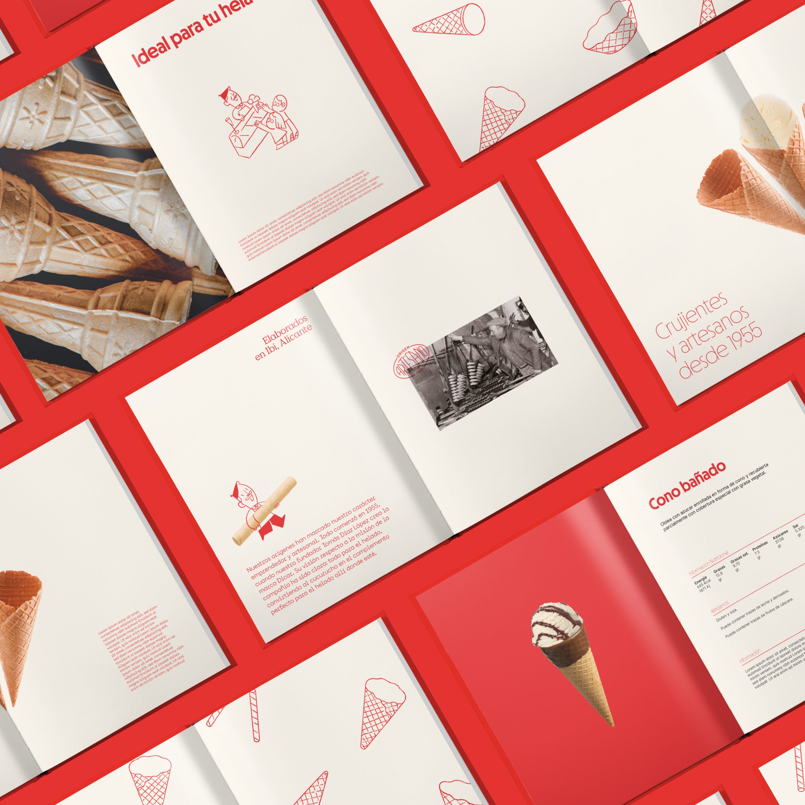
Regarding the packaging, it was crucial to create a pattern that would standardize the entire line of containers and be recognizable and memorable for consumers. We eliminated the noise and created a simple, functional package where the product, logo, and corporate colors were the main focus. In this way, in addition to highlighting the product, we would ensure that the customer remembered it during their future supermarket purchases.


We developed a comprehensive visual system for the brand, which we later applied to its main channels, both offline and online: their new website, styles for social networks, animations, trade show stands, product catalogs, advertisements, and outdoor advertising supports, primarily.
In summary, Dicar now projects the same image across all its channels and has become a memorable and more consumer-friendly brand.