Jenkin’s: Branding and global identity for an American food restaurant
Naming, creation of the brand and its graphic universe, packaging and intervention in spaces

What did we do?
· Creative management
· Brand workshop
· Naming and claims
· Brand identity
· Coordinated graphics
· Illustrations
· Packaging
· Lettering and intervention in spaces
· Social media graphics
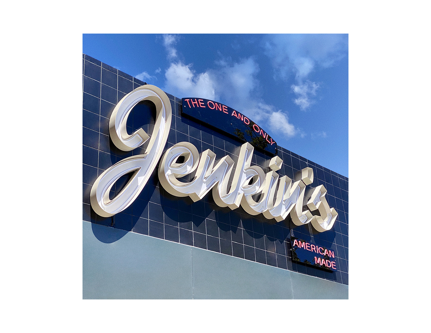
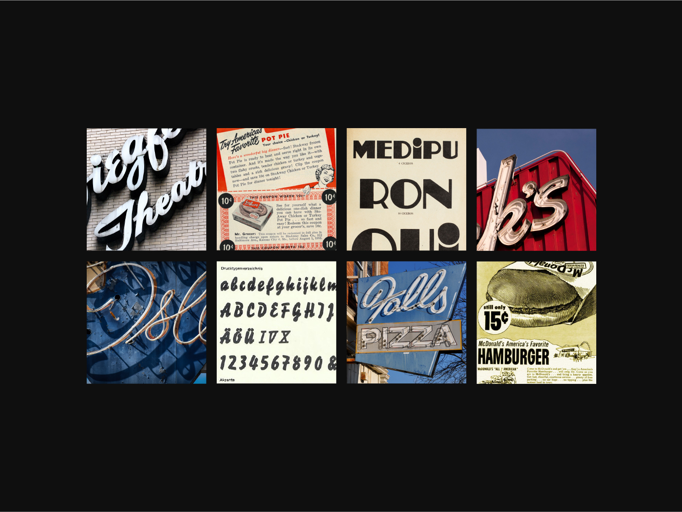
The chosen name – “Jenkin’s” – was the result of a complete process of work focused on conveying the client’s values and the values of their idea for the restaurant. Therefore, Jenkin’s means authenticity, American style, steakhouse. From the start we worked with the client through workshops and presentations for various proposals in order to perfectly capture the essence of their gastronomic offering.


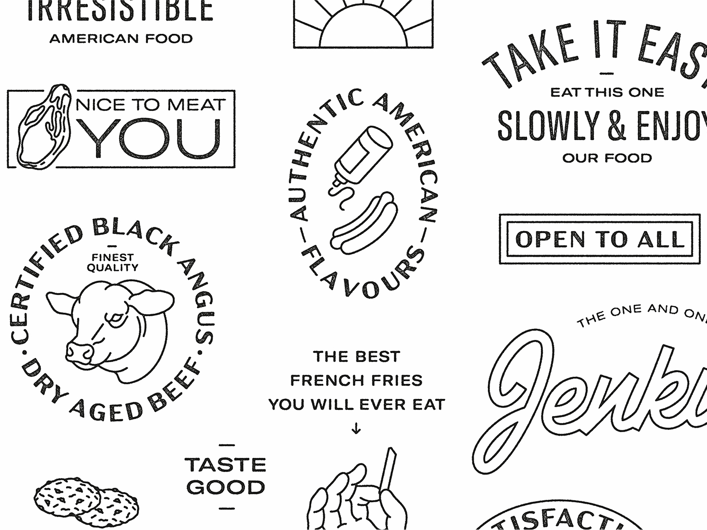
Wordplay such as ‘Yes, we cook’ or ‘Nice to meat you’ were some of the claims we created for the brand.
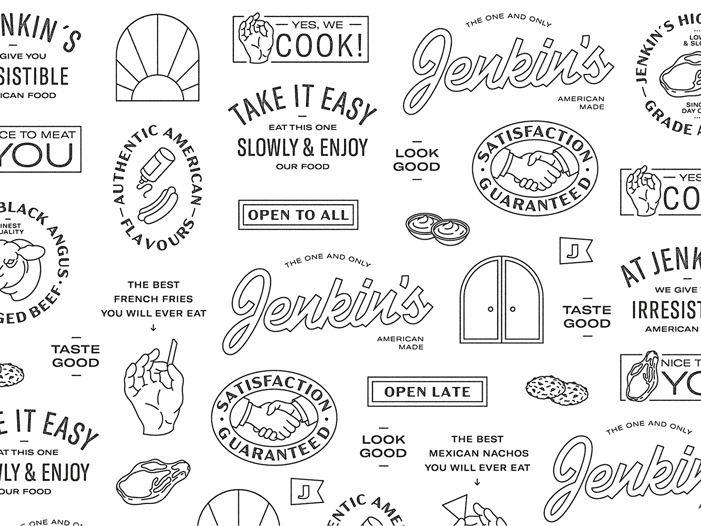


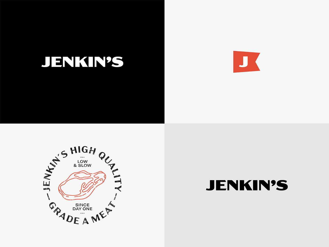
Apart from the main logo, we developed a second brand especially targeted at the digital world, with a very representative avatar with the “J” from Jenkin’s which allows it to have its own personality online and in social media.
We also developed a series of logo stamps for their meats, sauces… these illustrations work as quality stamps and at the same time grant that unique voice to the communication.
The whole graphic line that was created impregnates the branding and it can be seen in each of its applications, making Jenkin’s a complete brand that works perfectly online and offline.

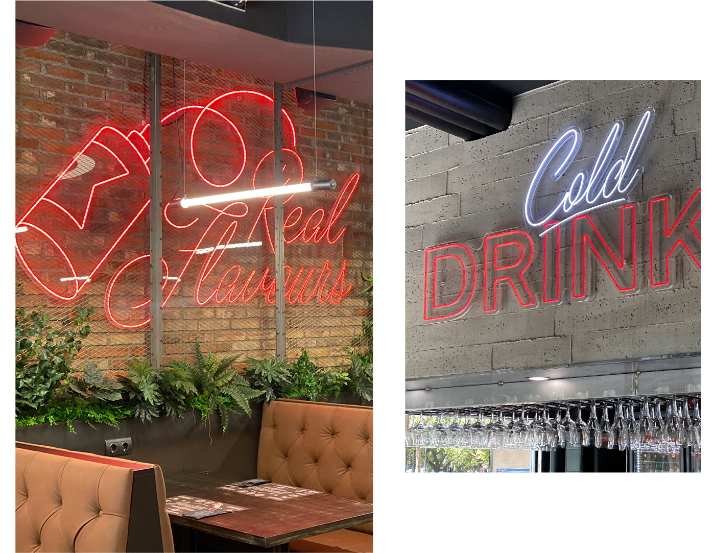


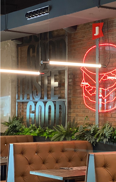
For the intervention in spaces we created a series of neon signs combined with other ones in raw metal that created a very unique atmosphere. Therefore, coming into Jenkin’s means being transported to one of the authentic American restaurants in the 50s. All the pieces aim to create a complete and unique atmosphere with a vibrant personality. It’s enough to just enter this restaurant to have a whole different experience!




Algunas de las fotografías han sido cedidas por @eat_jenkins

