Corporate identity, packaging and applied graphic design for La Hoja de Roble Hotel
Creation of the logo, corporate stationery, merchandising elements and applied graphics for the different packaging elements of the hotel’s products
La Hoja de Roble is a hotel located in a large, seventeenth-century house in the historic center of the medieval village of Puebla de Sanabria, Zamora Province. Its business has strong relationships with clients, careful attention to detail and an appreciation for traditions.
The hotel is beautiful and meticulously cared for, but it did not have a visual identity for itself, let alone a recognizable logo, which is what led Gustavo, its manager, to ask us to create the hotel’s corporate identity. The goal was to create an identity that fused tradition and modernity, which resulted in us designing a figure that could be used as a seal or a blazon, but drawing from more pleasant and modern shapes and graphic design sources. The idea was also to illustrate one of the representative elements of the region, acorns, as well as that of the hotel’s namesake, the oak leaf. The combination of black and white with the sans font gave it the present-day touch that the client needed.
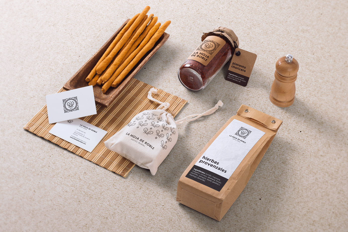
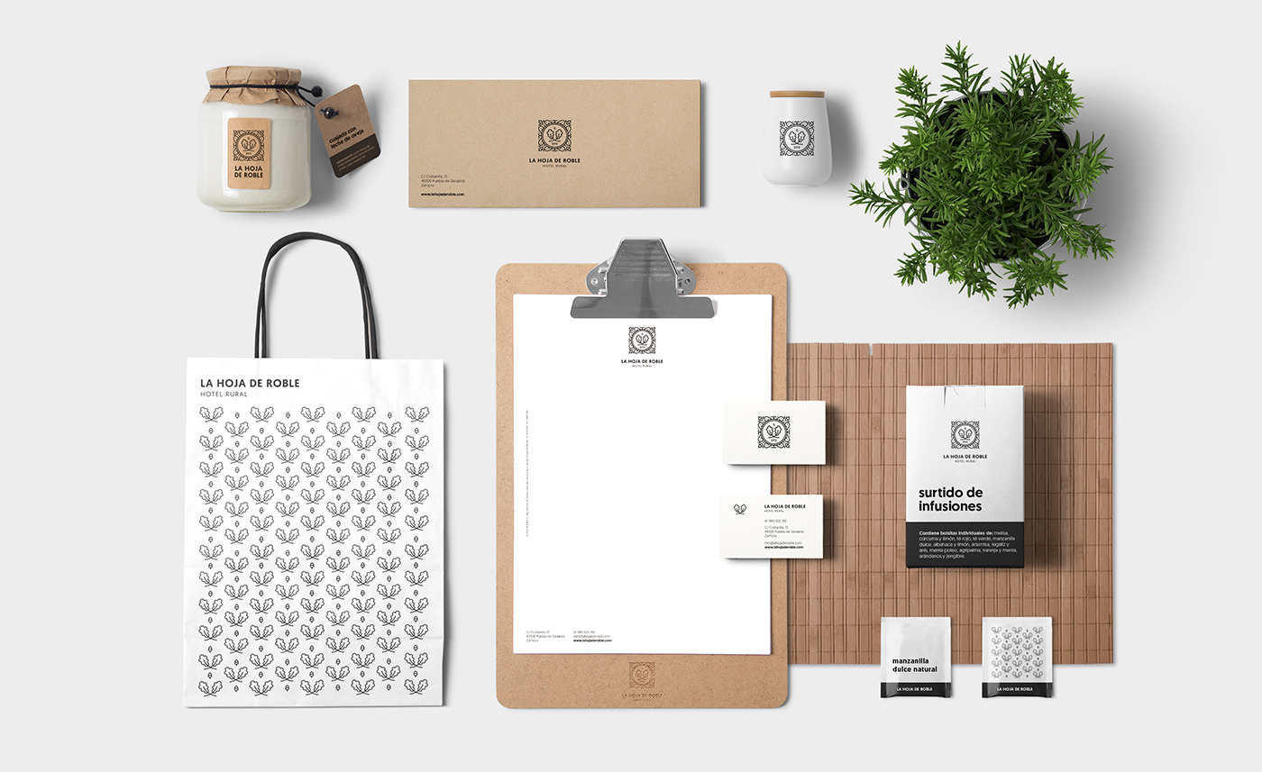
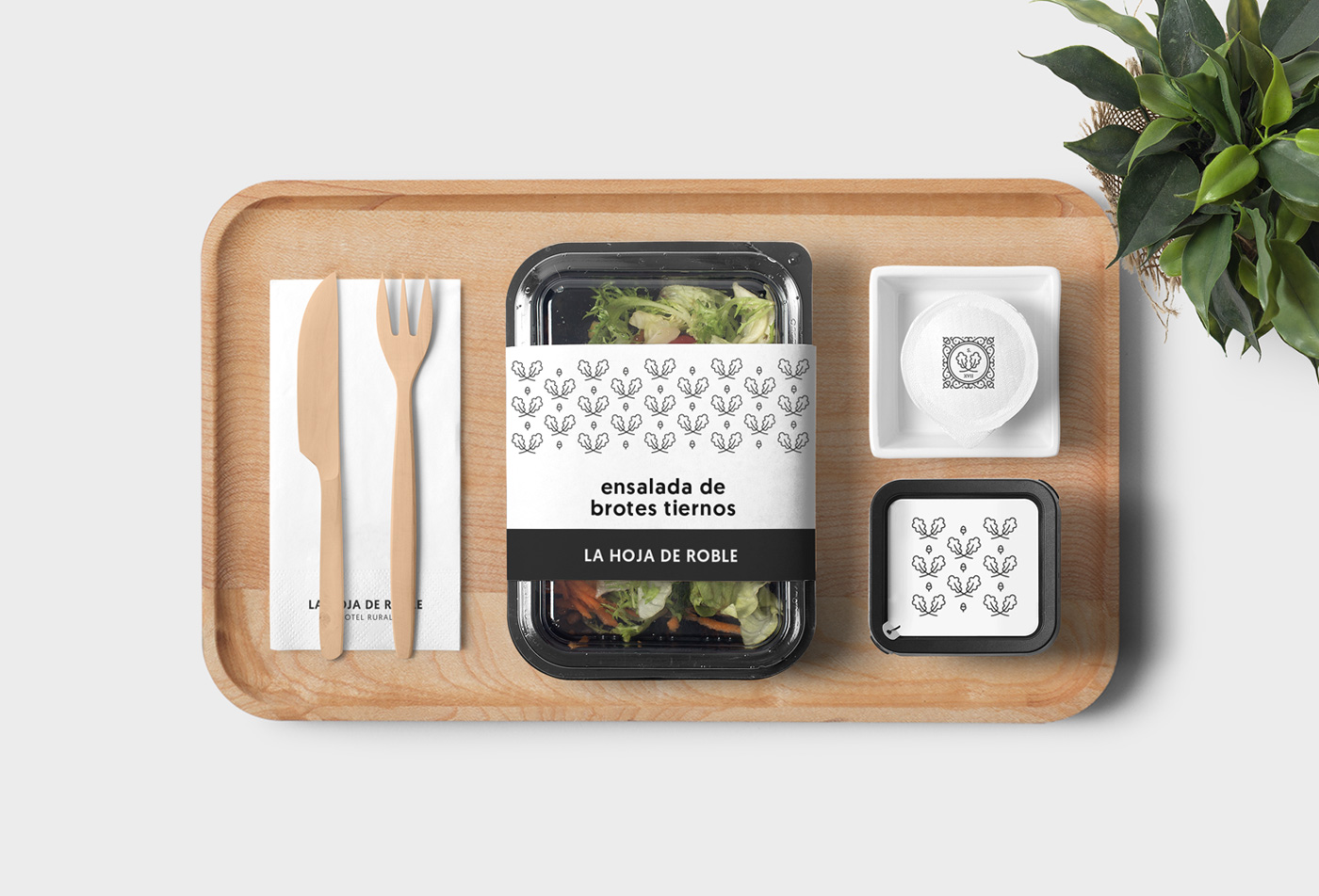
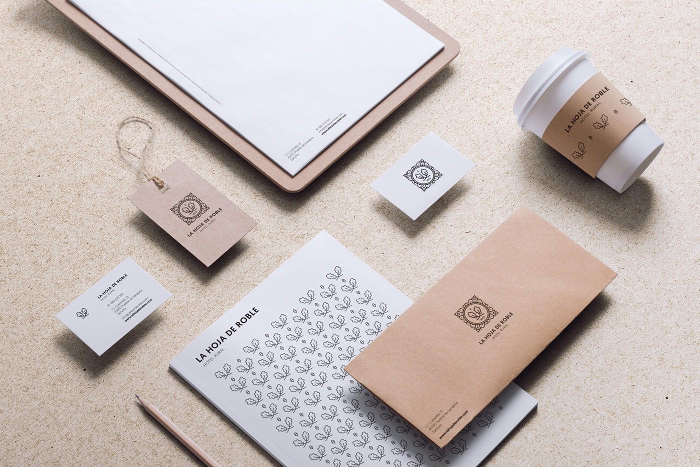
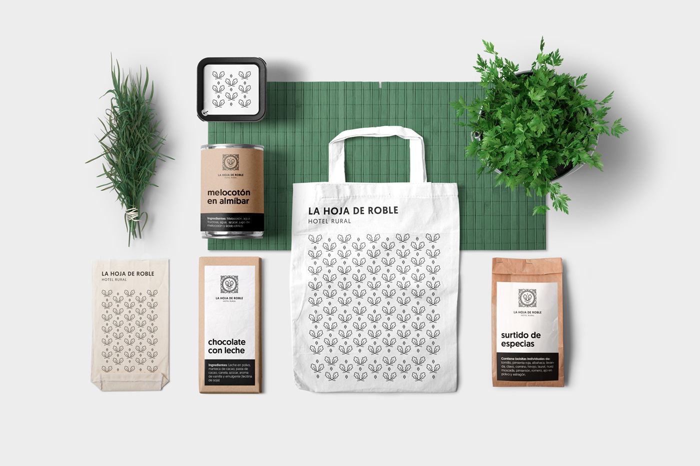
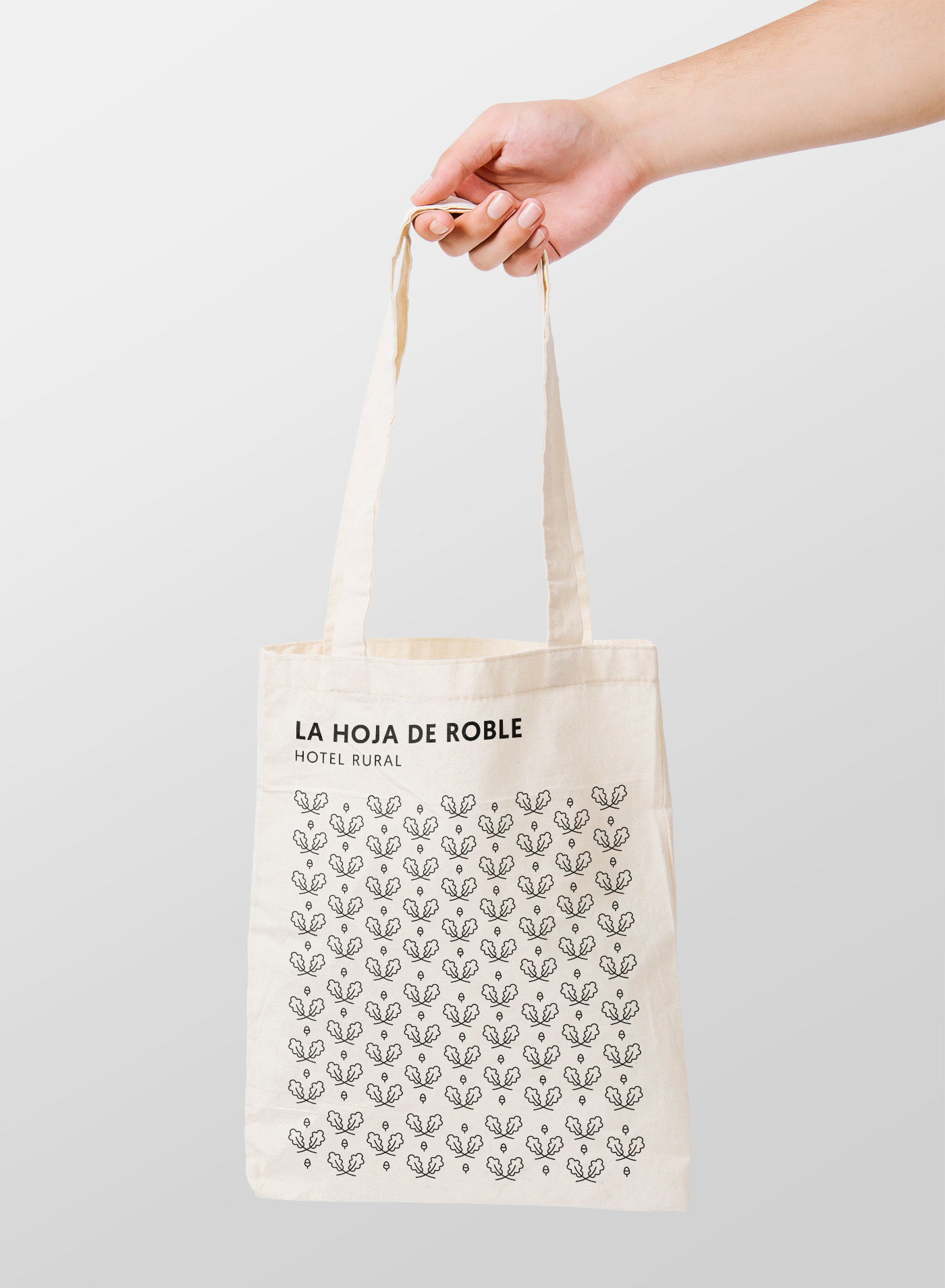
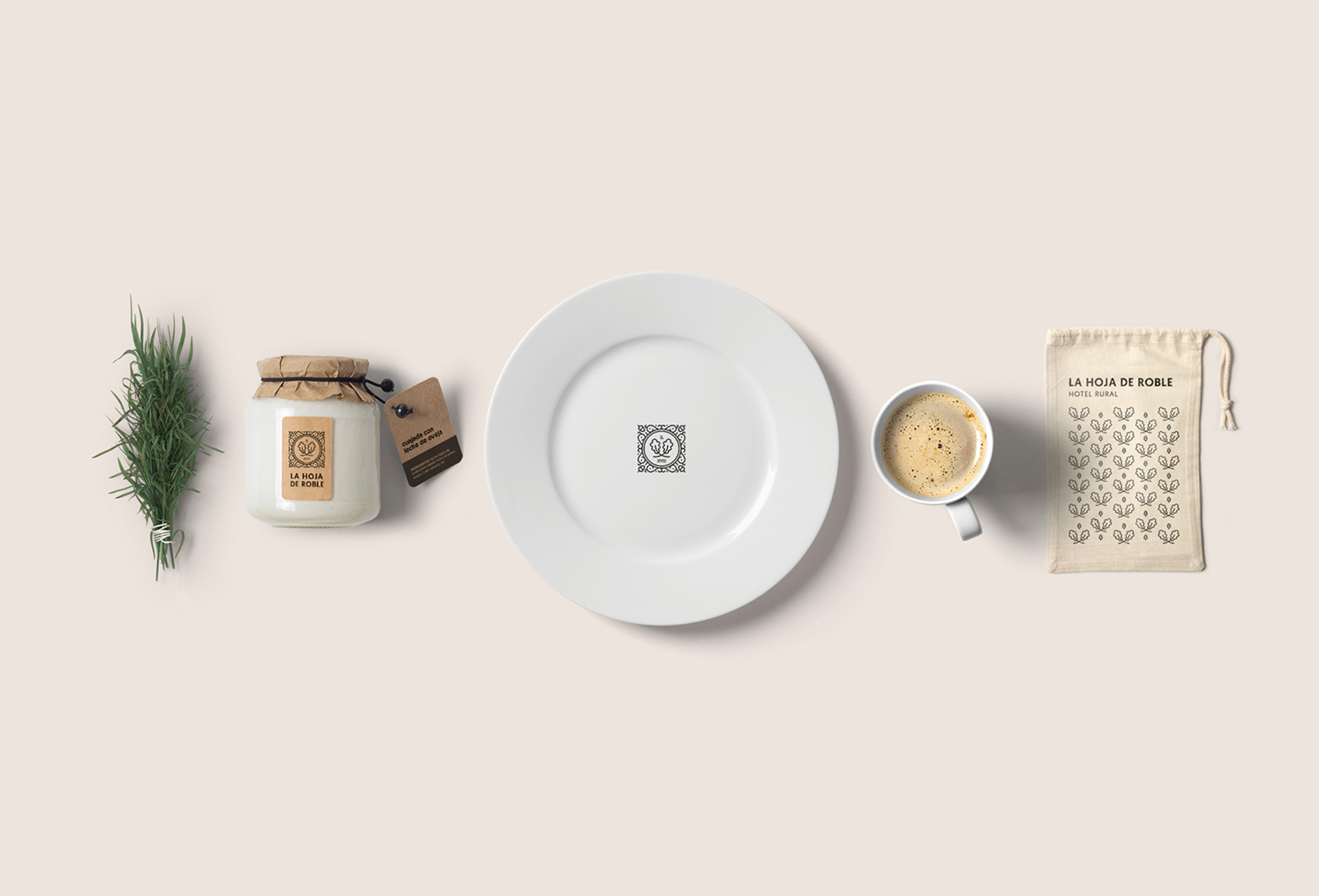
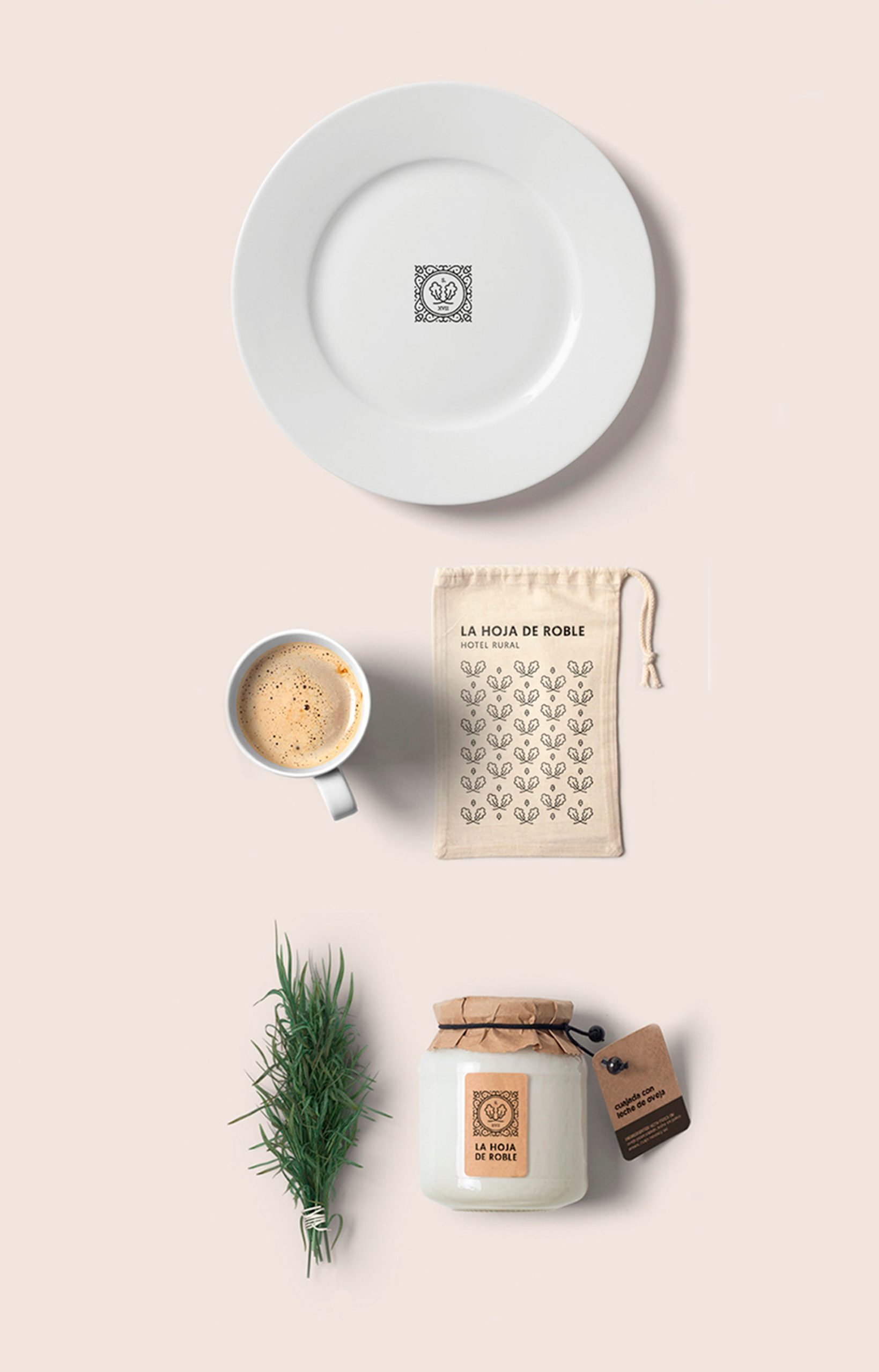
In addition to creating the logo for the hotel, we produced all of the corporate stationery, the graphic design for flatware, the labels for its wine, packaging for each of the hand-made products and foods that the hotel itself makes and sells, and other merchandising objects such as fabric bags or salt shakers.
With several elements from its log, namely the oak leaves, we created a motif, or pattern that worked perfectly wherever it was applied: plates, glasses, mugs, napkins, bags or lids for the different products.
What did we do?
· Creative direction
· Corporate identity
· Coordinated graphics
· Packaging
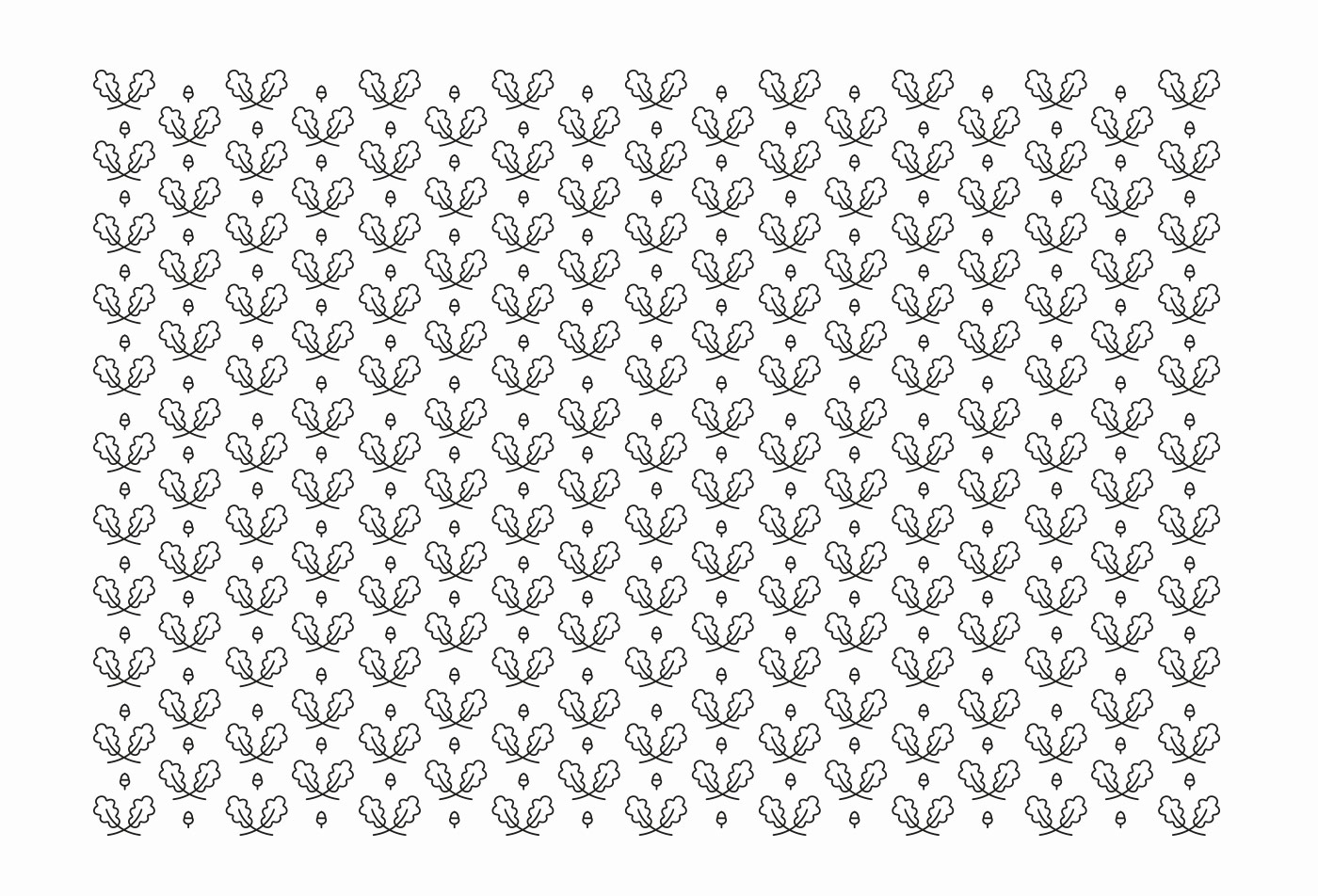
“The objective was to create an identity that combined tradition and modernity, which is why we opted to design a figure as a seal or crest, but using more pleasant and modern forms and graphic design resources.”
“The idea was also to illustrate one of the representative elements of the area: acorns. The combination of black and white with a sans typography, ended up giving it the current touch that the client needed.”
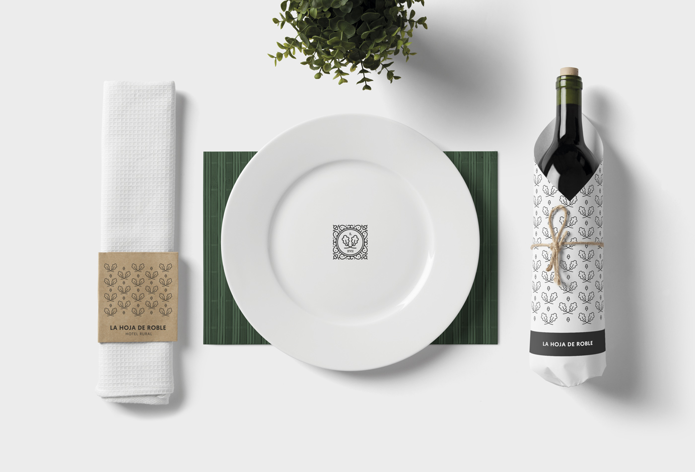
“We carried out all the corporate stationery, the graphic design of tableware, the labeling for the wine, the packaging of each of the artisanal products and foods that the hotel itself produces and sells, and other merchandising objects, such as cloth bags or salt cellars.”