FETÉN: Comprehensive Branding for a New Mass-Market Pizza Brand
Creation of naming, storytelling, corporate Identity, visual system, and packaging.
When we started the project, we knew it wasn’t an easy challenge: creating a new pizza brand for the consumer goods sector, i.e. chains of stores and supermarkets at a national level, and differentiating it from the rest in a highly saturated market such as the pizza industry.
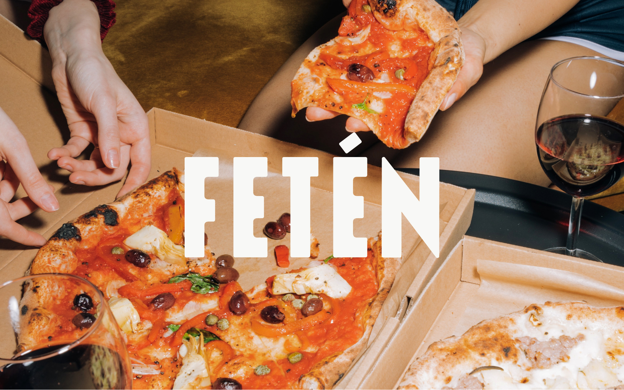
One thing was clear to all of us, both the client and the design studio: it had to be a different, fresh brand that stood apart from the visual codes used in the sector. The industry maintains a very classic aesthetic with little differentiation between brands. If you want to make a name for yourself in a sector with such established brands, you need to do something different, both in terms of product and branding. In the various meetings and contacts with the client, one thing they conveyed was that the ingredients they used to make their pizzas were of high quality, and it was important to communicate this from any touchpoint of the brand: naming, visual system, and especially packaging. And what better name than the one chosen: FETÉN.
A name that honors the taste of their pizzas and the moments it transports you to, whether with family or friends, enjoying while watching a game, snuggled up on a Sunday on the couch, or any of those days when we don’t feel like cooking and want to treat ourselves with a good pizza. That’s FETÉN!
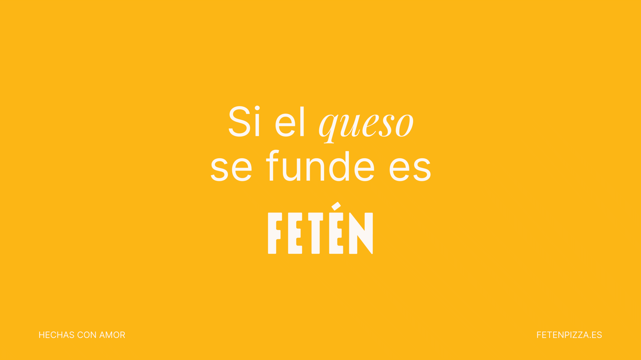
Once the name was chosen, it was important to give the brand a storytelling and create a claim that lived up to it: “Moments that taste good.”
What did we do?
· Creative direction
· Naming & claims
· Corporate Identity
· Coordinated graphics
· Packaging
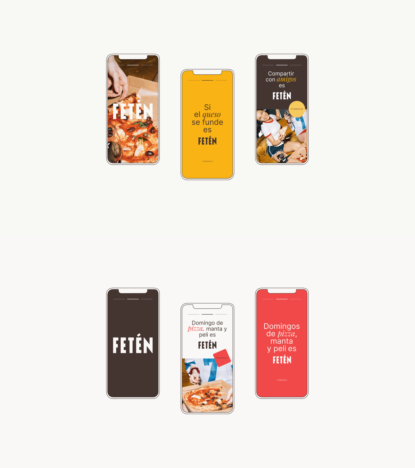
· Social Media graphics
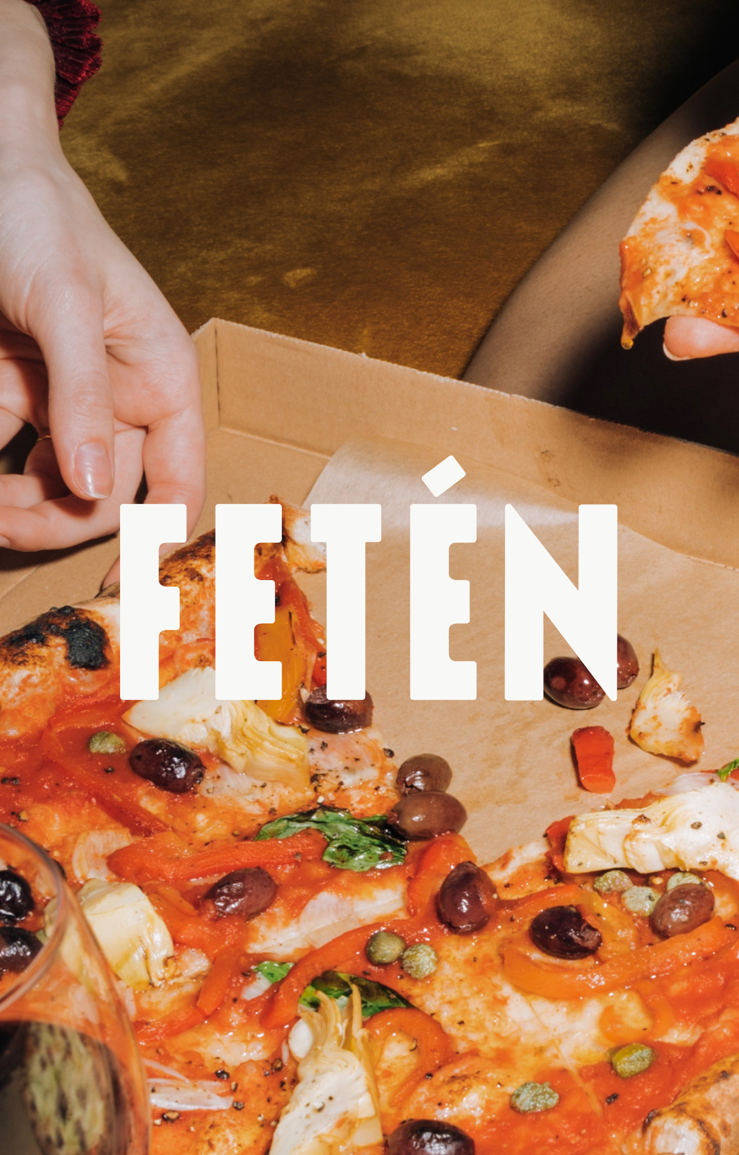
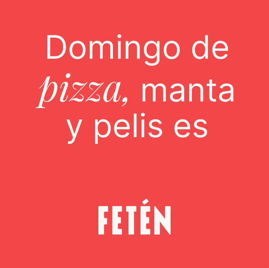
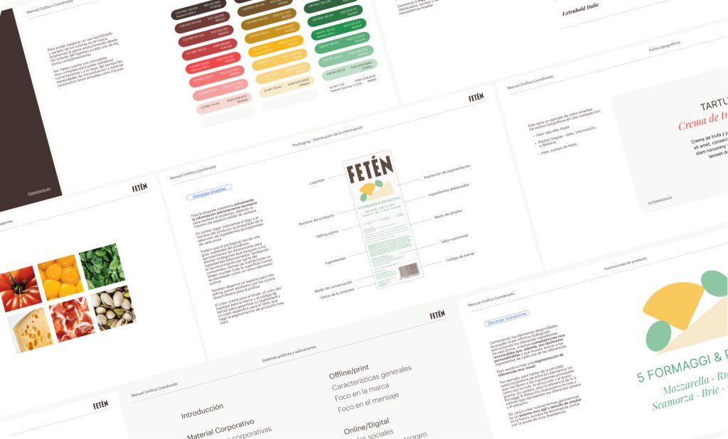
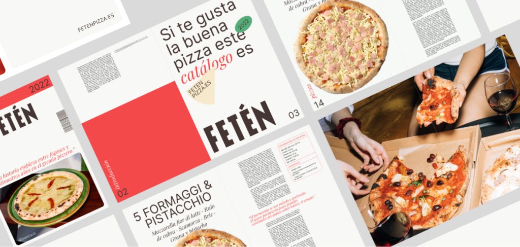
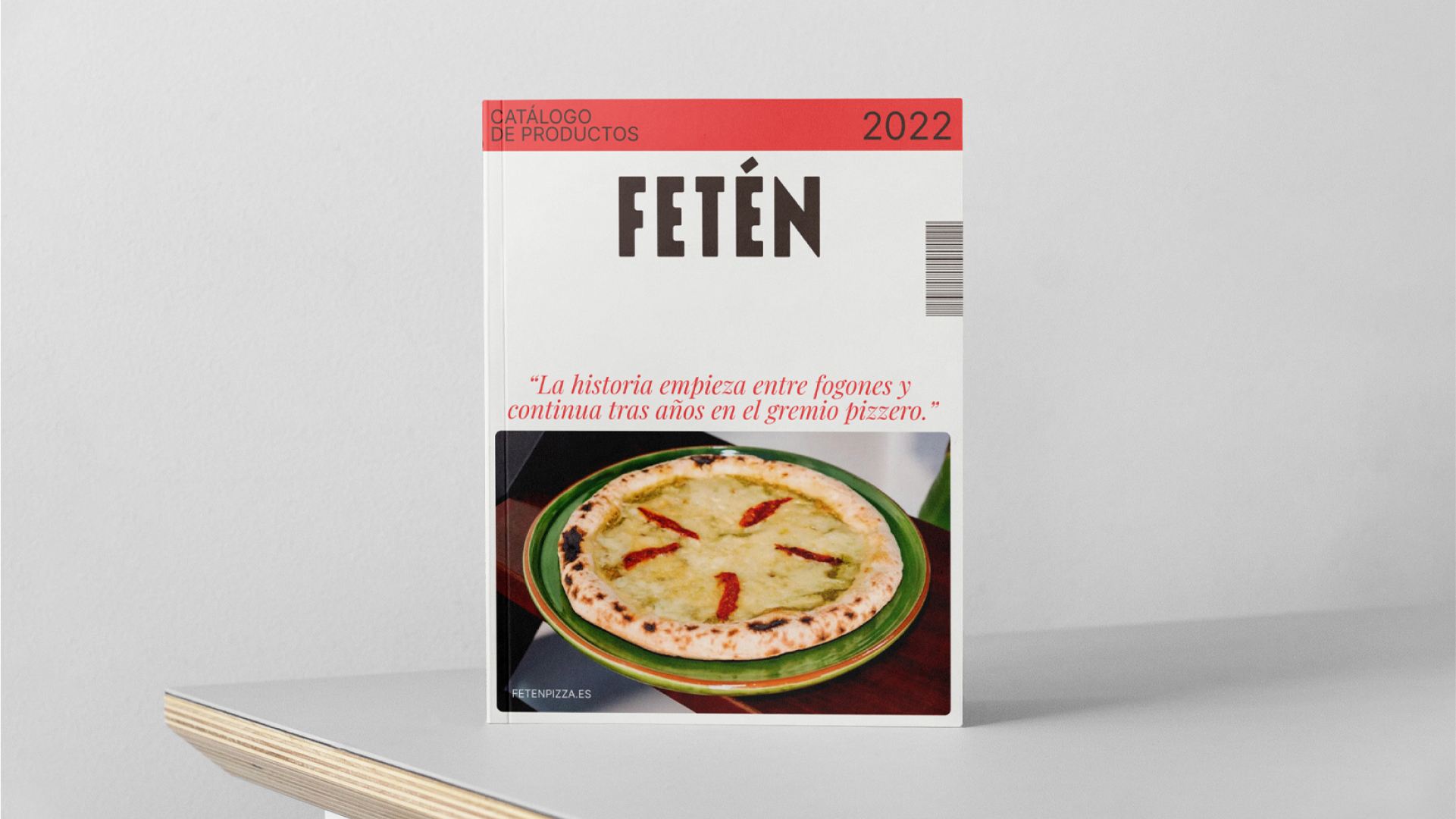
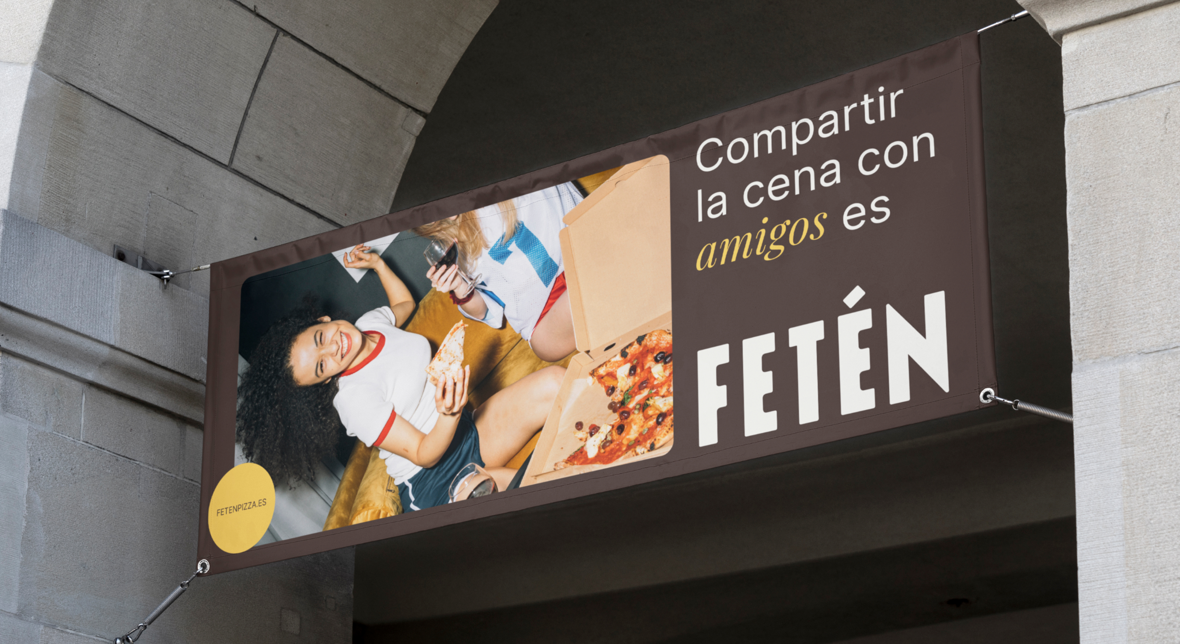
To create the identity, we opted for a logo as powerful as the concept it conveys: a bold all-caps typography that would not go unnoticed on any supermarket shelf. In addition to the logo, we created a complete visual system that would work both offline (packaging, signage, product catalog, etc.) and online (website, social media, animations, etc.). When we create a visual system for a brand, we ensure that it maintains consistency across all media and formats, for which we create typographic styles and a color palette that can be applied to different channels and media.
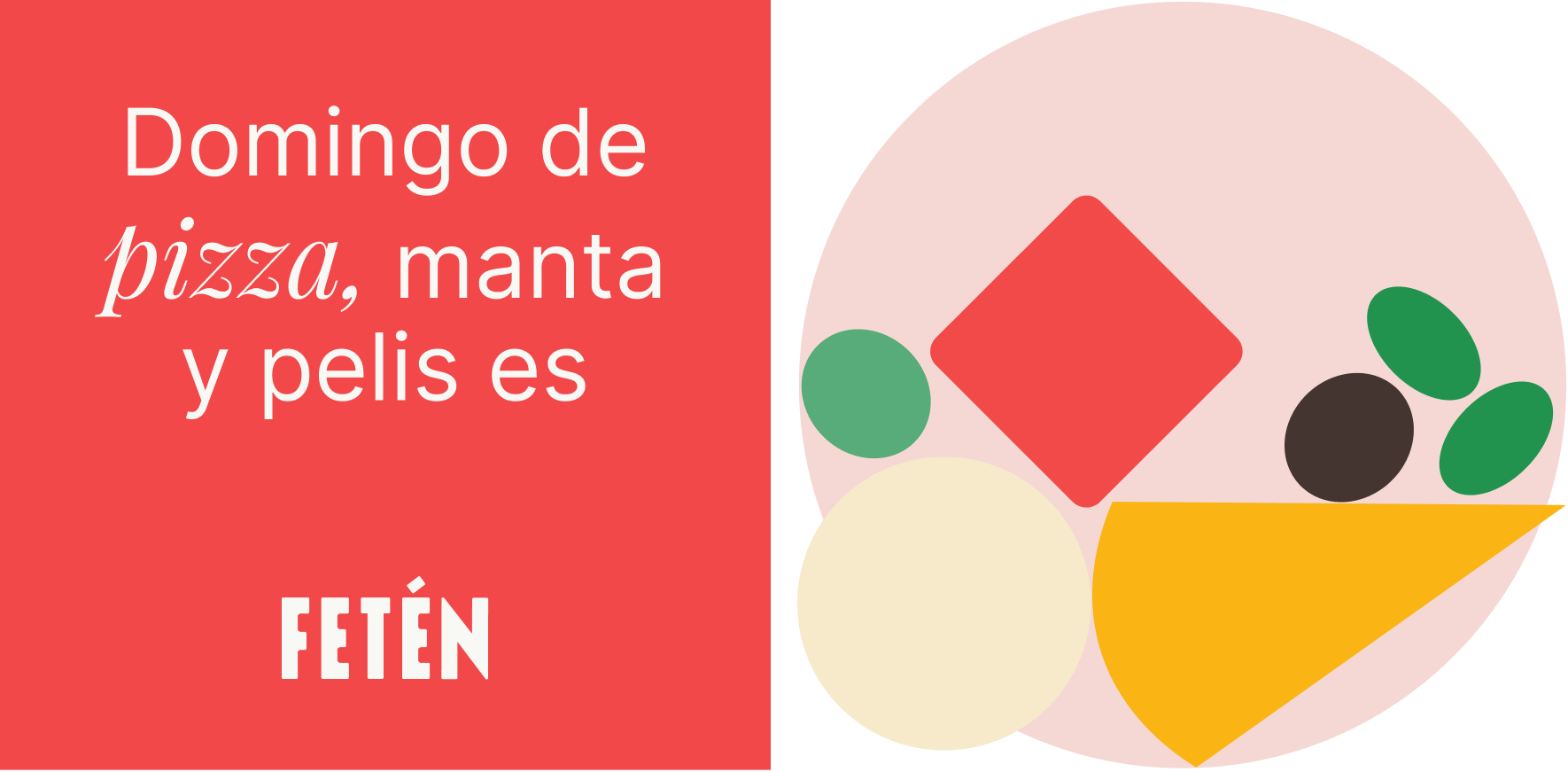
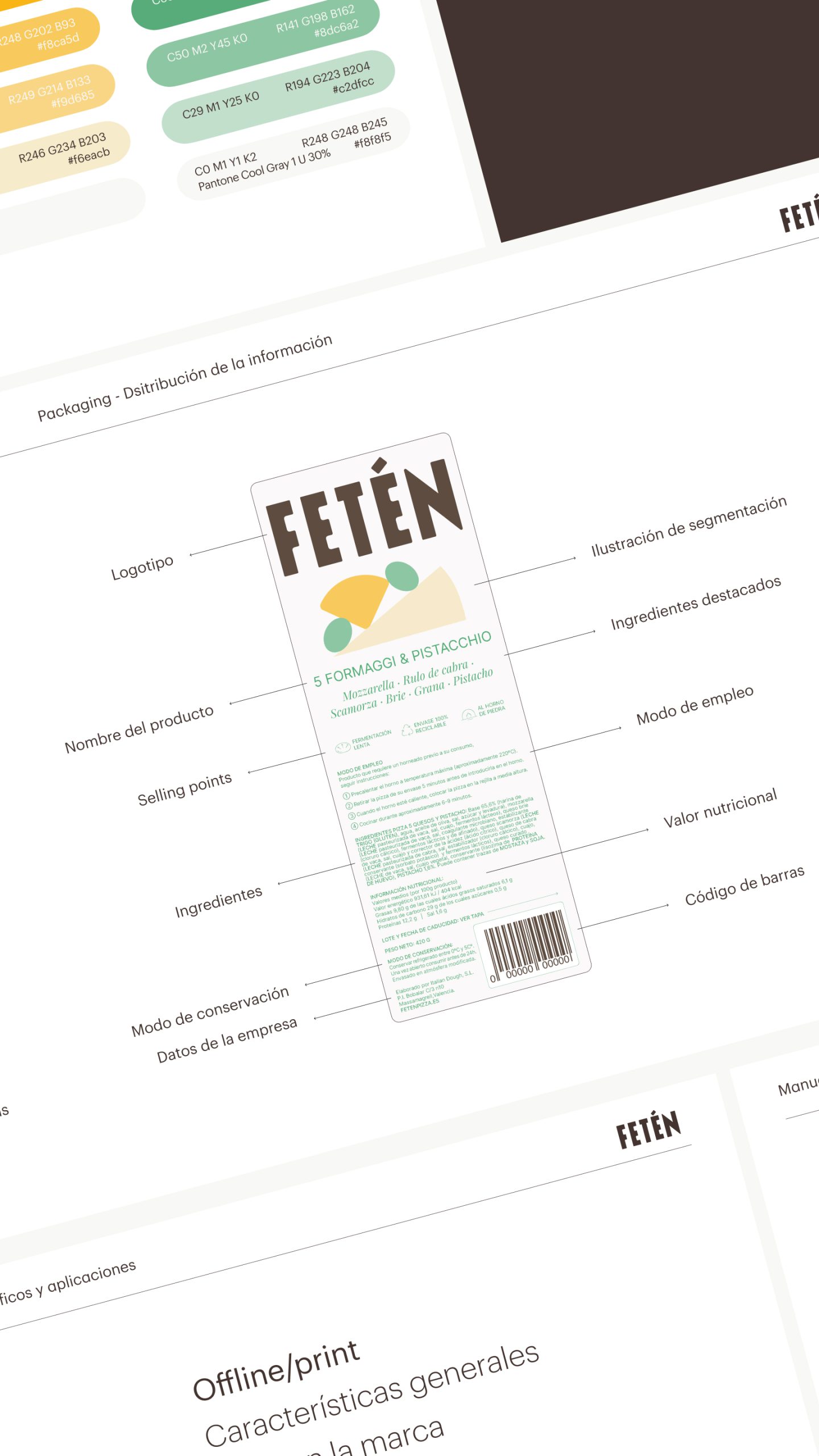
For the packaging, we opted for a front label that allowed the product to be perfectly visible through the transparent packaging, thus highlighting its ingredients. These labels, like many of the elements created, were based on typographic compositions and geometric elements that represented the different ingredients of each pizza. This system allows the product line to expand in a simple and recognizable way for the consumer.
The overall result is a simple identity with a great personality, making it very recognizable and easily memorable for consumers.