Burbur: brand identity, coordinated graphics and packaging for a new brand for pets
The importance of creating a graphic universe to connect with the consumer
Burbur is a new brand for pets that is born in the spirit of being familiar, fun and different. The client already knew our work at Pixelarte in relation to other brands in this sector and that is why they decided to trust us to make their product become a whole universe for pets. The goal? Creating a brand, a packaging and a communication strategy that would allow Burbur to connect with the consumer in order to support their decision to buy, and that would enable them to compete from the start with big brands that were already established in the pet’s world.
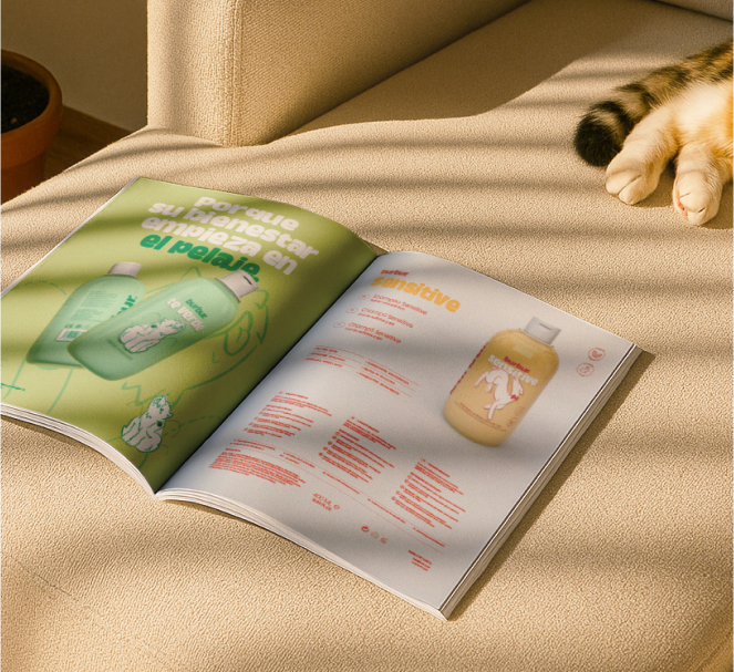
The result is a branding and coordinated graphics that are fresh and lively, designed to work perfectly both in digital channels and outlets.
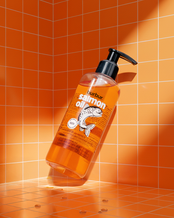
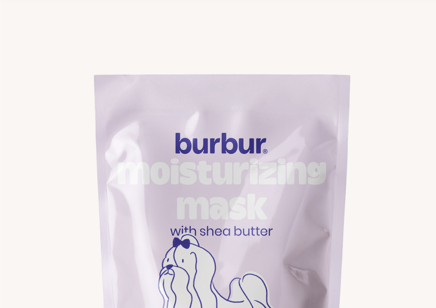
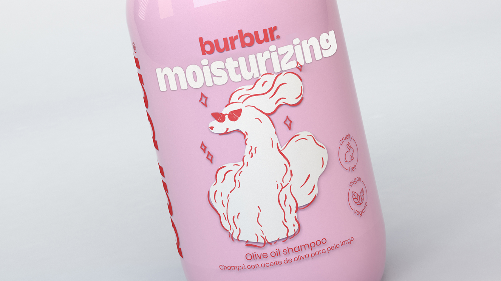
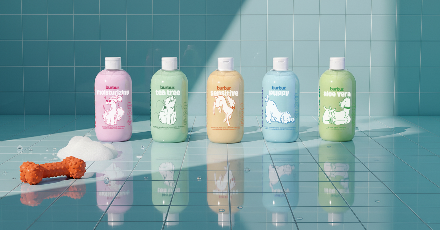
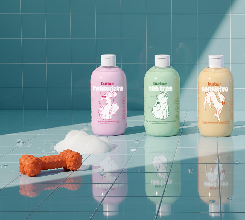
As a first implementation of the graphics, we created a line of shampoos for dogs and cats, one of the most consumed products for those who have canine and feline friends. Our goal was to create a range that would draw attention and make a difference when it comes to quality.
What did we do?
What did we do?
· Creative management
· Naming and claims
· Brand identity
· Coordinated graphics
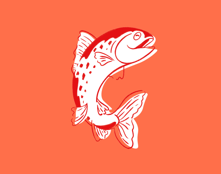
· Illustrations
· Packaging
· Social media graphics
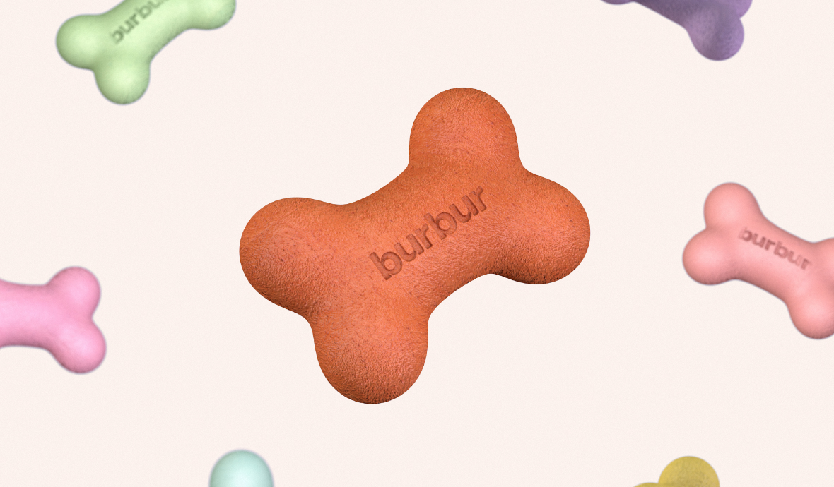
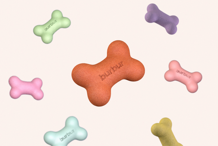
· 3D visualization
For the logo we personalized the typography to reinforce the brand values. In doing so, the result was a familiar logo that has great presence and details that immediately make you think of pets.
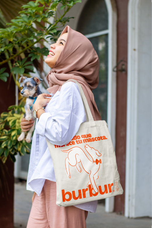
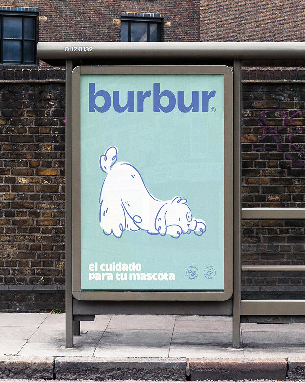
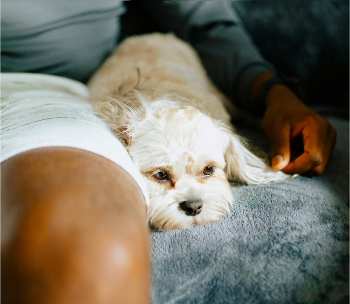
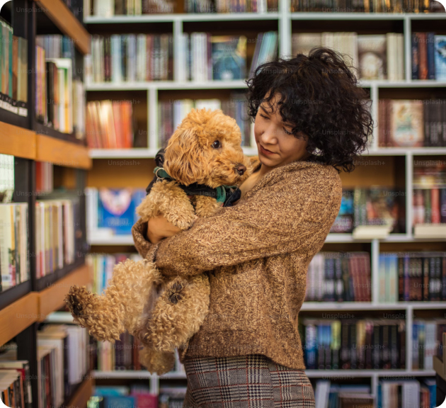
Burbur is a brand that was born with a 100% digital spirit, made to have a great personality online and in social media. That is why we created coordinated graphics that adapt to the online and offline world, with flashy colours, photographs with their own original style and typographies that perfectly represent the brand values.
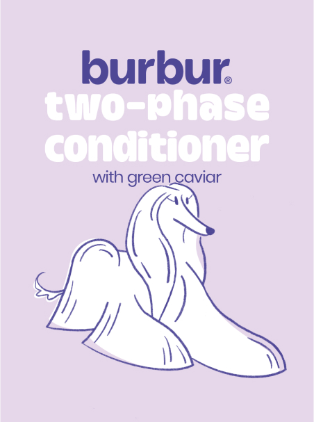
As it is a very visual brand, the graphics are completed with 3D elements and renderings that take us to the world of pets.