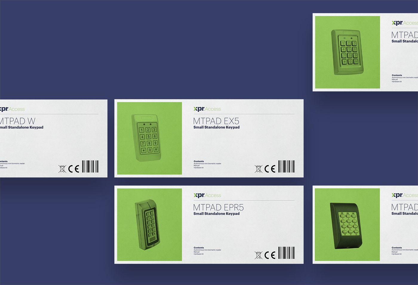
Corporate identity, editorial and packaging design for the Belgian company, XPR
Design for the main logos, product packaging and segmentation of the brand for the manufacturer from Brussels, Belgium
XPR, a company headquartered in Brussels (Belgium), is specialized in manufacturing mechanical and electronic closing products and access control systems for companies and businesses.
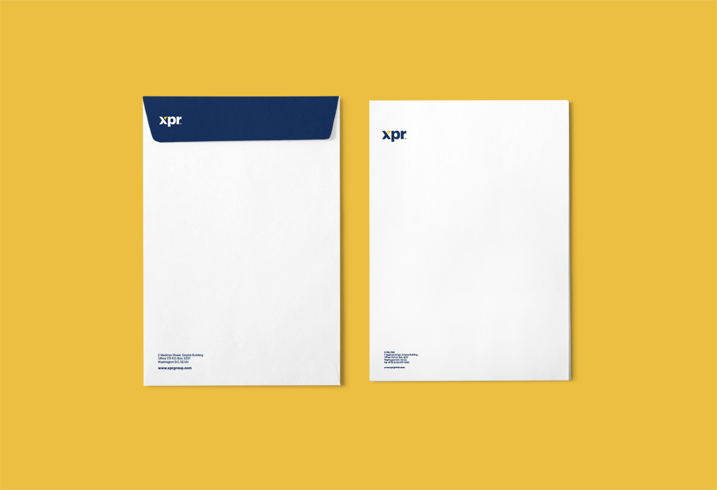
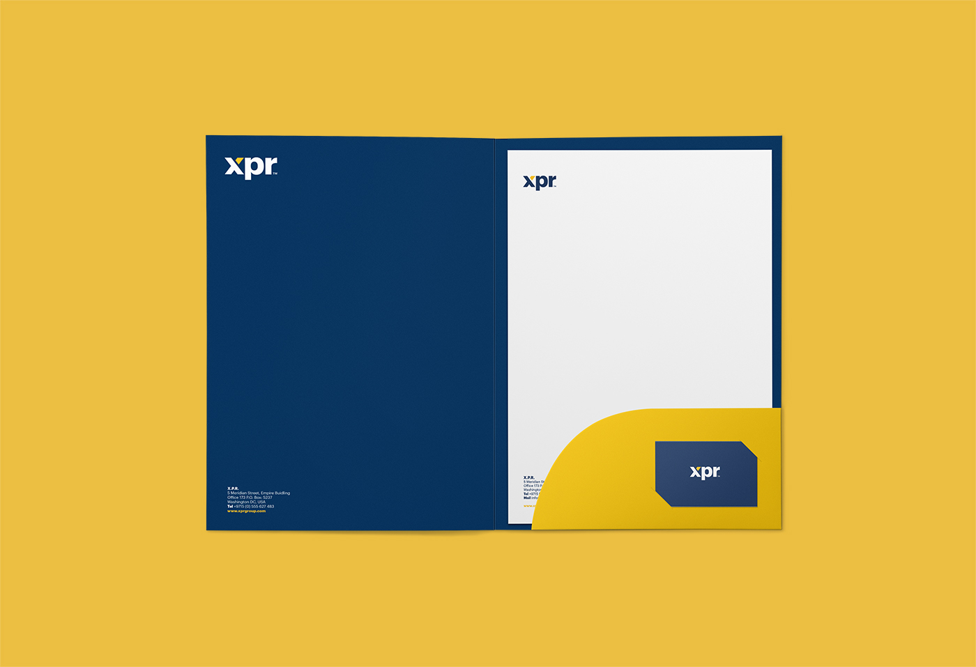
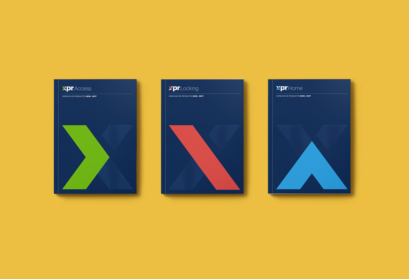
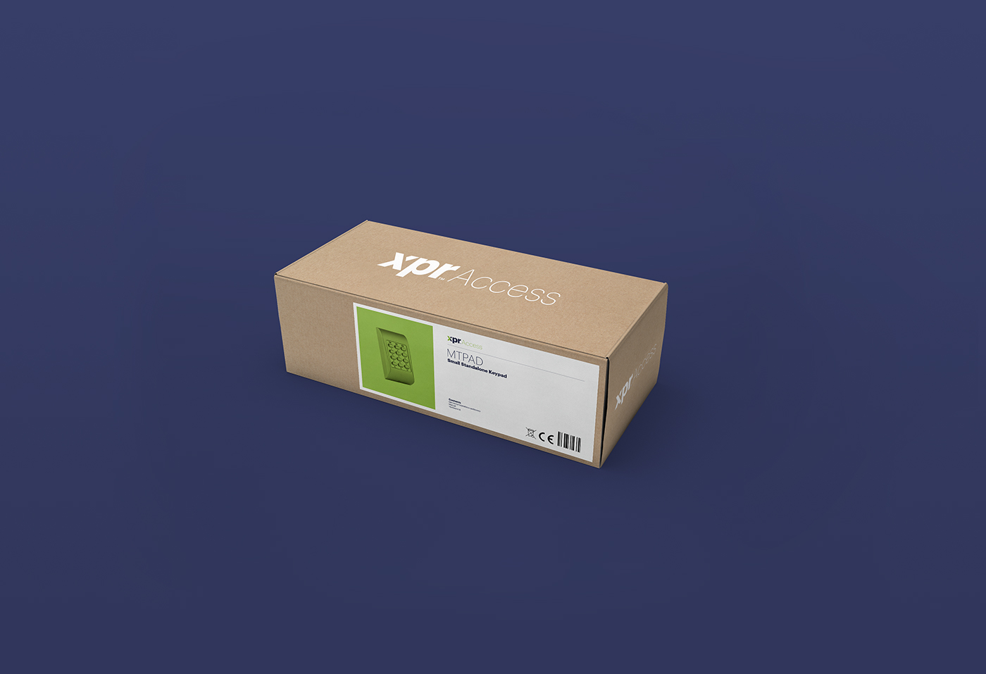
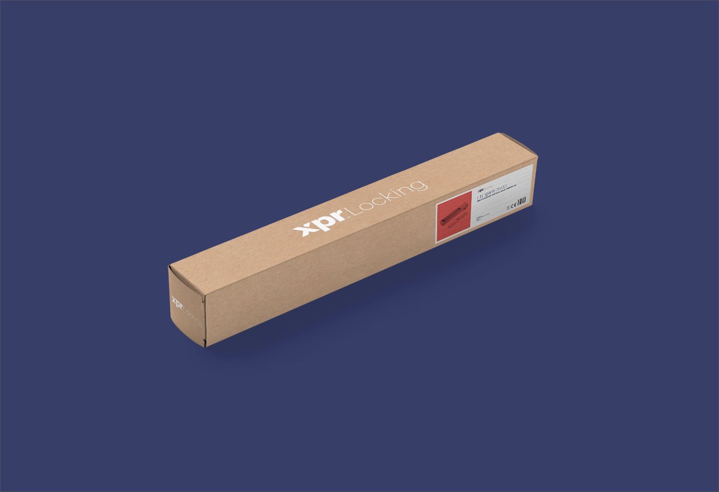
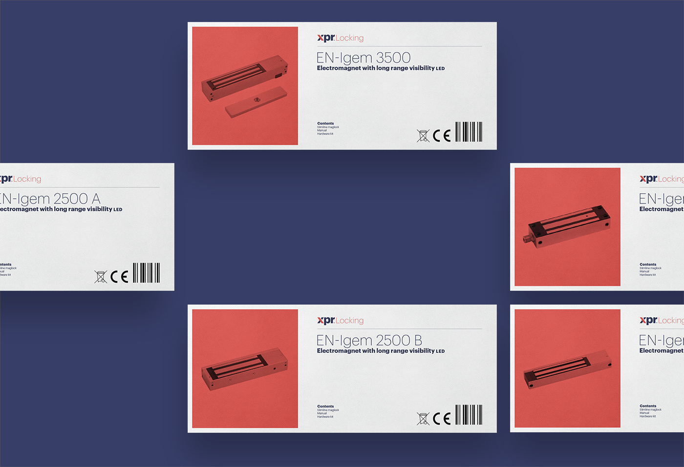
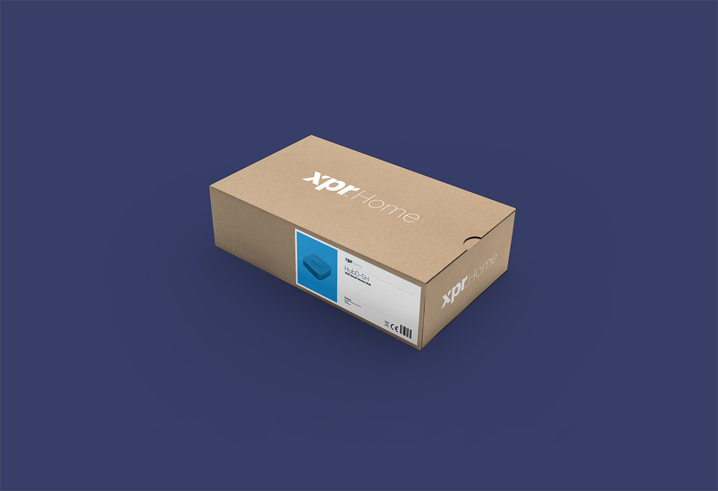
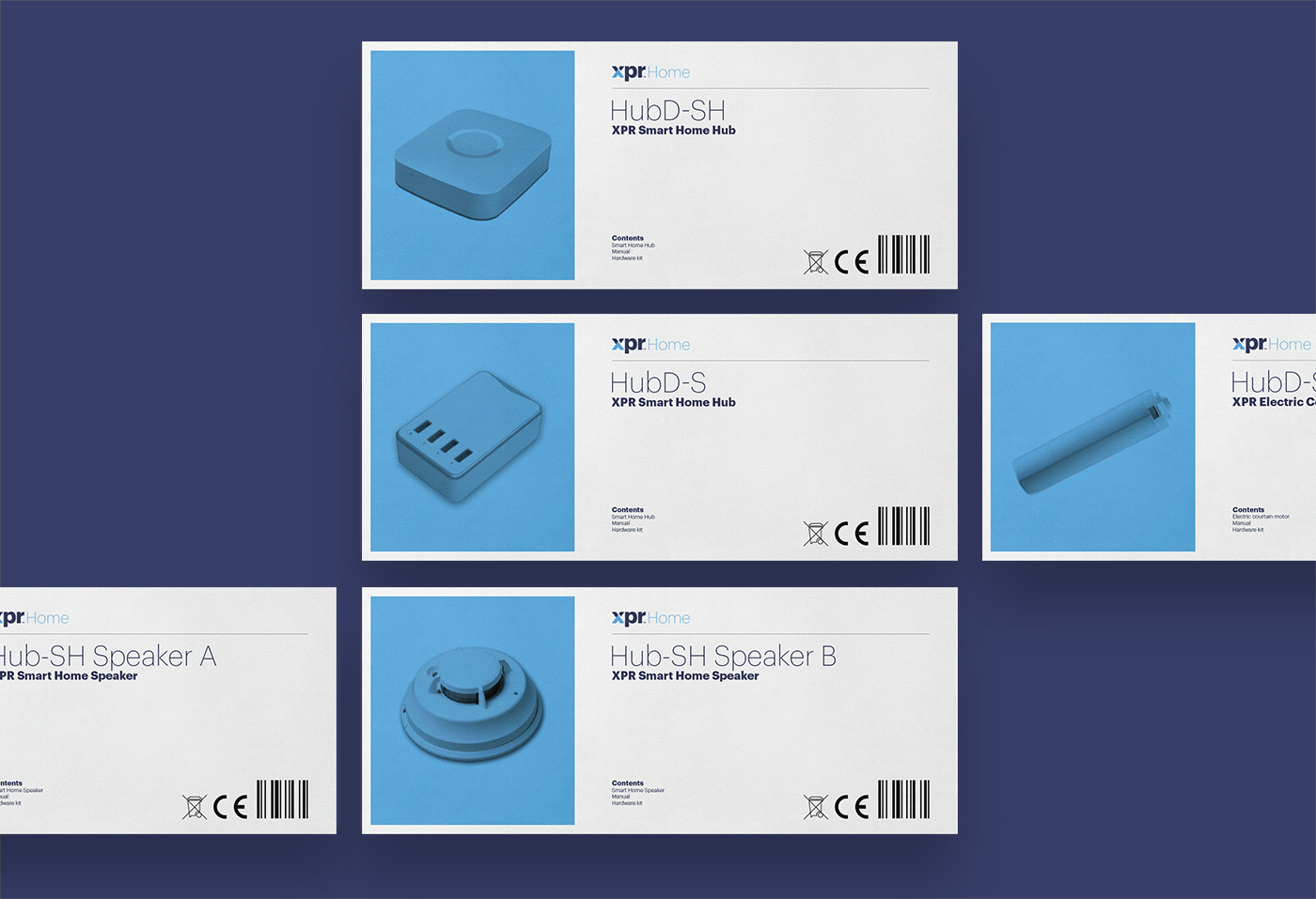
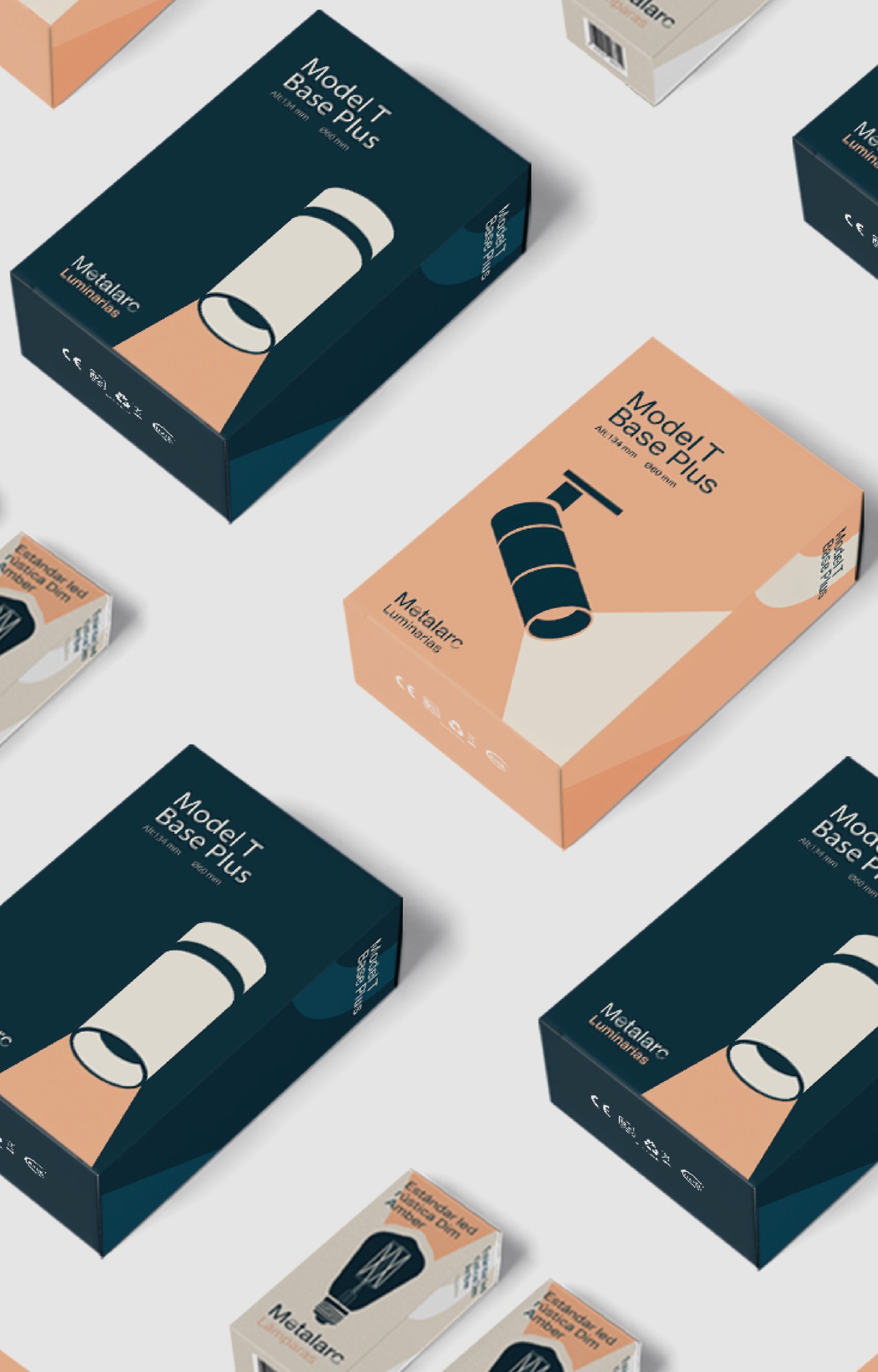
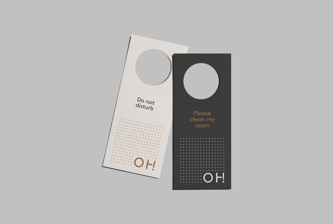
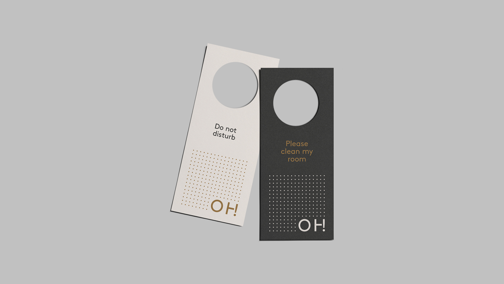
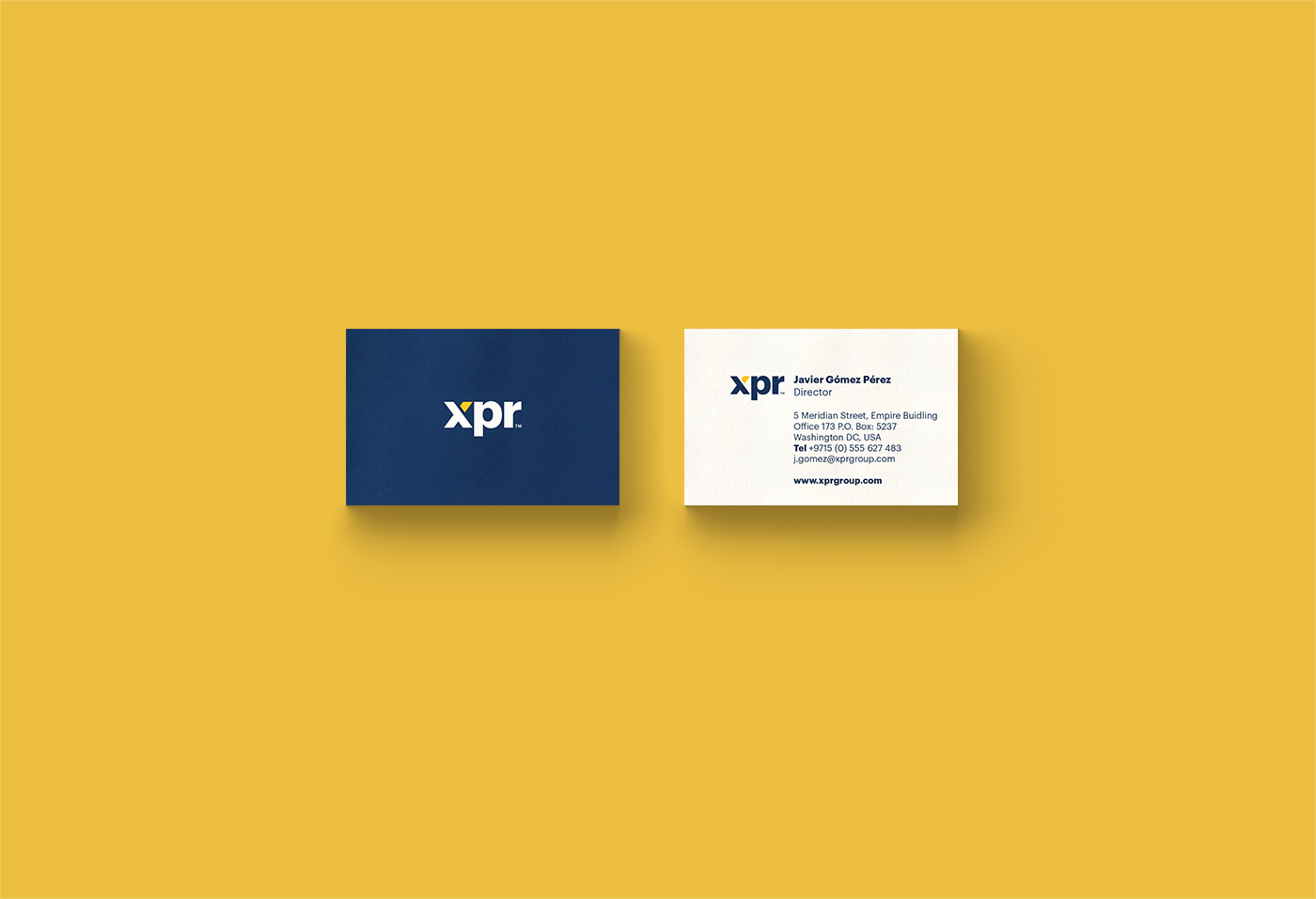
The new millennium ushered in a new generation of business managers, so they decided to build a new distribution network on each continent through solid and efficient trade agreements, in addition to expanding their family of products by launching a new home automation line. It was for this purpose that they decided to contact us and put us in charge of creating their main logos and those of its three business lines, as well as the graphic design for its supports, such as the corporate stationery, labelling and packaging of its products, or the image of its catalogues, thus achieving the consistency required for internationalizing its products and positioning itself in the market.
Our task was to create a completely new corporate identity that highlighted the three features that best define XDR’s philosophy: the design and innovation of their products, the robustness that has given them over 30 years of experience in the sector and the personalized treatment that they offer their clients. Integrating the three business lines and the group’s brand into the same sign – the X in its name – is the most representative element of this identity, in addition to the use of lower-case letters and segmentation through the use of color, which gives XPR the image of a solid and contemporary corporation.
What did we do?
· Creative direction
· Corporate identity
· Packaging
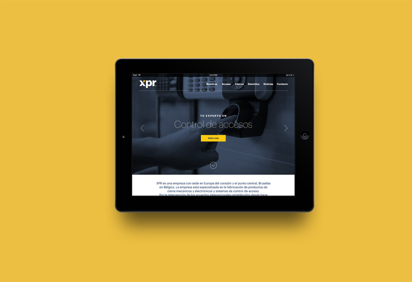
· Web prototyping
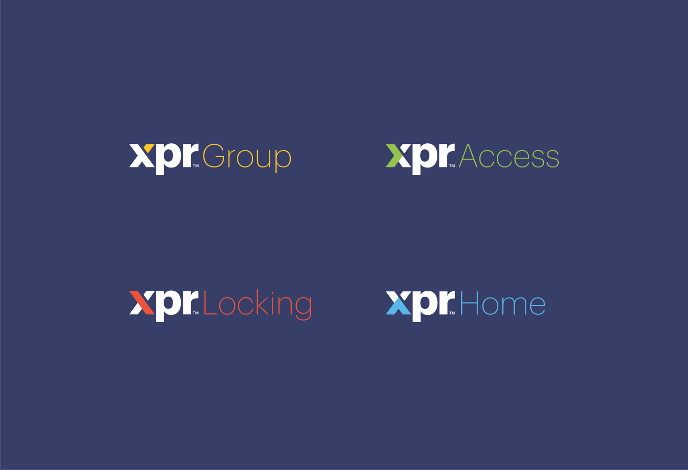
“We created their main logo and the logos for their three business lines, as well as the graphic design for all their media: corporate stationery, labeling, and packaging.”
“The integration of the three main business lines plus the group’s brand in the same sign – the X of the name – is the most representative element of this identity, in addition to the use of lowercase letters and segmentation through color, which gives XPR an image of a solid and contemporary company.”
“Our job was to create a completely new corporate identity that highlighted the three characteristics that best define XPR’s philosophy: the design and innovation of its products, the solidity given by its more than thirty years in the industry, and the personalized treatment they provide to their clients.”